From idea to market-ready product, our SIGNS solutions make every stage easier, faster. Discover How We Help

Views: 283 Author: Landea Signs Publish Time: 2026-07-24 Origin: Site


Content Menu
● Core Differences at a Glance
>> Practical priorities for parking signs
● ADA Interior Navigation Signs
>> Typical interior sign applications
● Compliance Details to Remember
● Materials and Manufacturing Choices
● FAQ
>> 1. Are ADA parking signs required to be tactile?
>> 2. Do interior navigation signs always need braille?
>> 3. Why are parking signs mounted higher than interior signs?
>> 4. What makes an interior ADA sign easier to use?
>> 5. Can one sign design work for both outdoor and indoor use?
ADA parking signs and ADA interior navigation signs both support accessibility, but they serve very different purposes. Parking signs identify accessible spaces outdoors, while interior navigation signs guide people through a building once they enter.
For manufacturers, architects, and facility owners, these two sign types should never be treated as the same product. They differ in placement, material choice, mounting height, visual treatment, and tactile requirements.
A parking sign must be easy to spot from a distance and remain visible when vehicles are parked nearby. An interior navigation sign must help people locate rooms, routes, restrooms, and other permanent spaces with clarity and confidence.
| Item | ADA Parking Signs | ADA Interior Navigation Signs |
|---|---|---|
| Main purpose | Identify accessible parking spaces and van spaces | Help users find rooms, routes, and building services |
| Typical location | Outdoor parking areas | Corridors, doors, elevators, and indoor decision points |
| Main content | International Symbol of Accessibility, plus "van accessible" where needed | Raised text, braille, pictograms, or directional wording |
| Reading distance | Viewed from a vehicle approach or across a lot | Viewed at close range while walking |
| Key compliance focus | Visibility, correct height, durable outdoor construction | Tactile readability, contrast, finish, and proper placement |
| Typical user need | Parking access and space identification | Wayfinding and room identification |
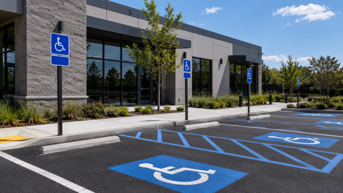
ADA parking signs are intended to identify spaces reserved for people with disabilities. The sign must show the International Symbol of Accessibility, and van-accessible spaces must be labeled accordingly.
These signs must be installed high enough to remain visible when a vehicle is parked in the space. That is why mounting height is not a minor detail; it is a central part of the design.
From a manufacturing perspective, parking signs need strong weather resistance, durable graphics, and reliable color contrast. They must stay readable in sun, rain, dust, and repeated outdoor exposure.
- Clear ISA symbol.
- "Van accessible" wording when required.
- Outdoor-rated substrate.
- High mounting position.
- Strong contrast and non-glare finish.
Interior navigation signs support movement inside a building. They help users identify rooms, locate restrooms, understand directions, and find accessible routes.
Many interior signs require tactile characters and Grade 2 braille when they identify permanent rooms and spaces. They also need non-glare surfaces, clear contrast, and proper character placement so they can be read efficiently.
This sign type has a stronger connection to user experience because it affects how people move through a space. A well-planned interior sign system reduces hesitation, backtracking, and confusion.
- Room names and numbers.
- Restroom identification.
- Elevator and floor identification.
- Direction to accessible routes.
- Emergency and egress guidance.
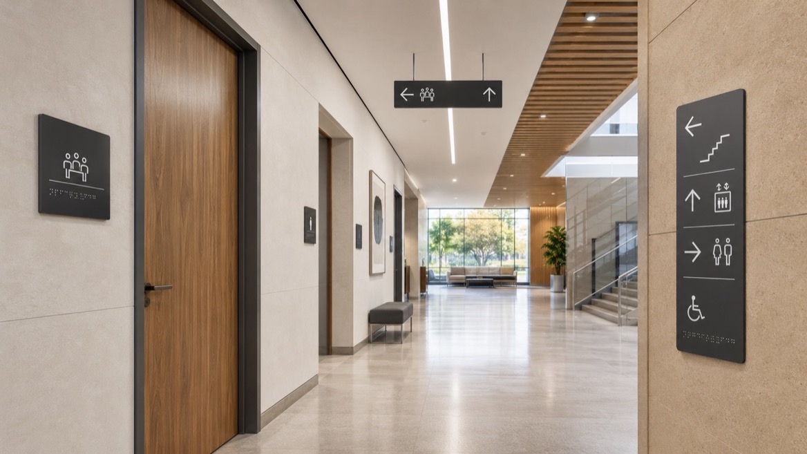
The design logic is different for each product type. Parking signs are built around long-distance recognition, while interior navigation signs are built around close-range clarity and tactile reading.
Parking signs should be simple, bold, and highly visible. Interior signs should be consistent, readable, and easy to understand even for first-time visitors.
The user journey usually looks like this:
1. The visitor arrives at the parking area.
2. The accessible space is identified by the parking sign.
3. The visitor enters the building.
4. The interior navigation sign directs the next step.
5. The final room-identification sign confirms the destination.
That journey shows why the two sign types work together rather than replacing one another.
The ADA Standards distinguish between signs that identify accessible spaces and signs that identify permanent rooms or spaces. They also distinguish between visual-only content and tactile content.
Important requirements include:
- Symbols for accessible spaces must use a non-glare finish and strong contrast.
- Tactile signs usually need raised characters and braille.
- Signs identifying permanent rooms and spaces often require tactile content.
- Parking signs must be mounted high enough to stay visible above parked vehicles.
- Interior tactile signs are generally mounted in a predictable range for touch access.
In actual projects, the biggest risk often comes from inconsistent installation rather than the sign artwork itself. A correct design can still fail if it is placed in the wrong location or at the wrong height.
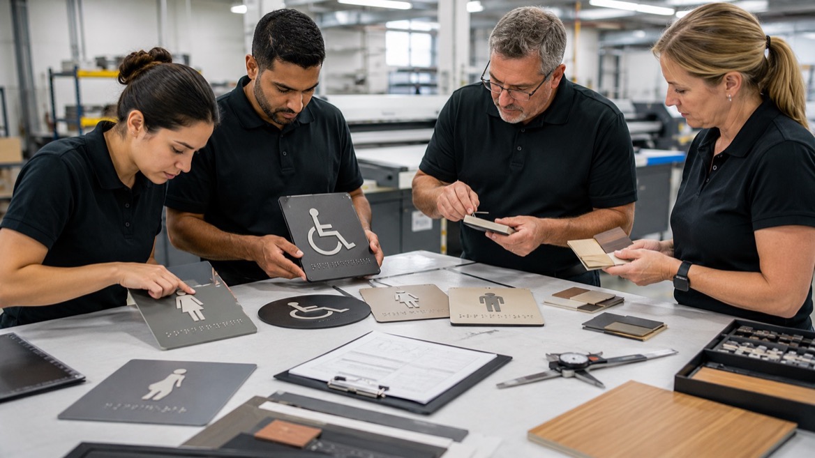
Manufacturing choices should reflect the environment in which each sign will be used. Outdoor parking signs need materials that can handle moisture, sunlight, and temperature shifts. Interior signs need precise fabrication, especially when tactile elements and braille are involved.
A strong production workflow includes:
- Standard templates for parking sign formats.
- Controlled tactile production for raised text and braille.
- Contrast checks before fabrication.
- Installation drawings for placement accuracy.
- Final inspection before delivery.
For a custom signage manufacturer, this separation matters because it supports quality control and easier project management. It also helps clients keep a consistent sign system across multiple sites.
One common mistake is assuming every ADA sign follows the same rules. Another is focusing only on appearance and ignoring placement, tactile content, or viewing distance.
Other frequent issues include:
- Parking signs installed too low.
- Van-accessible spaces not labeled correctly.
- Interior signs missing braille where required.
- Decorative fonts that reduce readability.
- Low-contrast finishes that make signs hard to see.
These mistakes can affect both accessibility and the overall impression a facility gives to visitors.
From a practical standpoint, the best signage programs are built around the user's path, not around isolated products. The goal is to guide someone from the parking lot to the correct room without uncertainty.
That means signage planning should begin with a simple question: What does the visitor need to know at each step? Once that is clear, the right mix of parking, directional, and tactile signs becomes much easier to define.
For manufacturers like Landea Signs Co., Ltd., this is also an opportunity to offer a more complete solution. Clients benefit when one signage system covers identification, navigation, and consistency across the whole property.
Before final production and installation, review the following:
1. Confirm whether the sign is for parking or interior navigation.
2. Check whether tactile content is required.
3. Verify contrast, finish, and readability.
4. Confirm the correct mounting height.
5. Make sure the sign is placed where users naturally look.
6. Review local code requirements if they are stricter than federal rules.
A simple checklist like this can reduce errors and improve project delivery.
ADA parking signs and ADA interior navigation signs share a common goal, but they solve different access problems. Parking signs identify accessible spaces outdoors, while interior signs help people navigate inside the building with confidence.
When each sign is designed for its exact purpose, the result is better accessibility, smoother movement, and a more professional facility experience. For manufacturers, that means better product planning, fewer installation errors, and stronger long-term value for clients.
No. Parking signs are mainly identification signs for accessible parking spaces, and the key requirements focus on the ISA symbol, visibility, and mounting height.
No. Braille is generally required for signs identifying permanent rooms and spaces, but not for every directional or informational sign.
They must stay visible even when a car is parked in the space, so the sign has to be placed above the vehicle line.
Clear contrast, a non-glare finish, raised characters, correct braille placement, and consistent mounting all improve usability.
Usually not. Outdoor parking signs and interior navigation signs have different environmental, visual, and tactile requirements.
1. U.S. Access Board. Chapter 7: Signs — https://www.access-board.gov/ada/guides/chapter-7-signs/
2. ADA.gov. ADA Standards for Accessible Design — https://www.ada.gov/law-and-regs/design-standards/1991-design-standards/
3. ADA Inspections Nationwide. ADA Compliant Building Signs — https://inspectionsada.com/ada-compliance-blog/2021/1/25/ada-compliant-signage
4. Nova Polymers. Your 2026 Guide to ADA Sign Design — https://www.novapolymers.com/ada-sign-design-guide/
5. Duncan-Parnell. ADA Signage Requirements: Compliance Guide — https://www.duncan-parnell.com/blog/10376/ada-signage-compliance-guide-duncan-parnell
6. Plotstuff. ADA Wayfinding Requirements Explained — https://plotstuff.com/knowledge-base/ada-wayfinding-requirements


