From idea to market-ready product, our SIGNS solutions make every stage easier, faster. Discover How We Help

Views: 210 Author: Landea Signs Publish Time: 2026-07-11 Origin: Site


Content Menu
● Understanding Braille Signage Choices
● What Are Text-Only Braille Signs?
● What Are Braille Signs with Graphics?
● Advantages of Braille Signs with Graphics
● Advantages of Text-Only Braille Signs
● Direct Comparison: Graphics vs. Text-Only Braille
● Compliance and Technical Design Considerations
● User Experience in Real Environments
● Industry Data and Design Trends
● Practical Selection Framework for Projects
● Customization Without Losing Accessibility
● FAQs
Braille signs with graphics give more intuitive guidance, while text-only Braille signs deliver focused, efficient information for experienced Braille readers. Both play critical roles in inclusive wayfinding, and the best environments usually combine them strategically. [universaldesign]
Braille signage is a tactile communication system designed to give blind and low-vision users independent access to information in public spaces. Raised dots, raised letters, and tactile elements translate location, function, and direction into a format that can be read by touch. For manufacturers like Landea Signs Co., Ltd., the key design decision is whether a sign should use Braille with graphics or remain text-only Braille, depending on the context and user needs. [accessability.rgd]
In real-world wayfinding, this choice influences how quickly a person can orient themselves, how safely they can move through a space, and how consistently they understand information across an entire building or campus. From a practitioner's standpoint, it is not about choosing one format forever, but about specifying the right mix for each project brief. [inclusive.sa.gov]
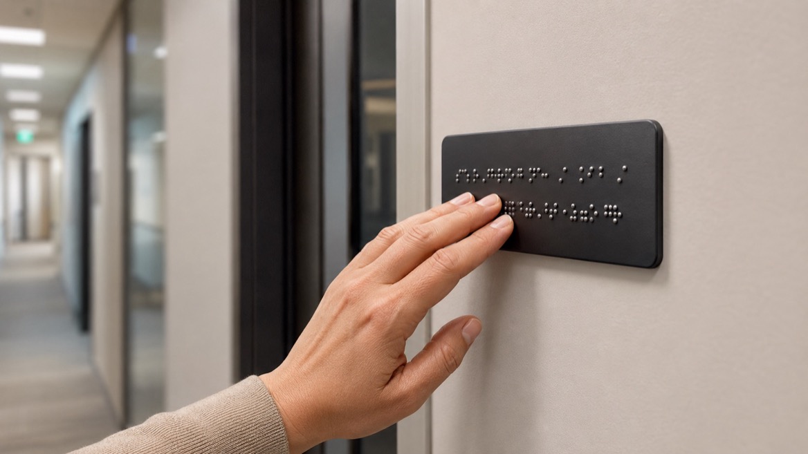
Text-only Braille signs rely purely on raised text and Braille, usually placed beneath the corresponding print text. They do not include raised pictograms, tactile arrows, or other graphic elements; the tactile reading experience is linear, word-based, and highly structured. [universaldesign]
Core characteristics of text-only Braille signs:
- Linear information delivery focused on words and numbers. [accessability.rgd]
- Compact layouts that occupy less surface area and can be installed in tighter spaces. [inclusive.sa.gov]
- Consistent tactile reading patterns, useful for frequent users who navigate by Braille every day. [scribd]
For simple messages—such as room numbers, floor identifiers, or regulatory notices—text-only layouts are often the most efficient solution.
Braille signs with graphics combine raised pictograms, icons, arrows, and layouts with Braille and raised text. The graphic elements are designed to be identifiable both visually and by touch, giving multimodal cues that support different user abilities. [universaldesign]
Typical features include:
- Raised symbols (e.g., restroom, elevator, wheelchair access), sized and spaced to be recognized by touch. [maplibrary]
- Directional arrows that can be traced by hand to understand movement paths. [inclusive-spaces]
- Structured layouts that group text, symbols, and Braille for faster pattern recognition. [numberanalytics]
For complex wayfinding—transport hubs, hospitals, campuses, shopping centres—these graphic elements help users create mental maps of the environment, not just read isolated messages. [maplibrary]

From an industry expert's perspective, Braille signs with graphics are particularly powerful in busy, high-stress environments where users must make quick decisions.
1. Multisensory comprehension
By combining tactile symbols, raised text, and Braille, these signs support people with different literacy levels and sensory preferences. A user who does not read Braille can still rely on a raised pictogram and an arrow; a user who does read Braille gets precise wording that confirms the symbol's meaning. [numberanalytics]
2. Faster orientation in complex spaces
Graphic layouts help users build mental maps: where they are, where key facilities are located, and how to move between them. Raised arrows, zone icons, and consistent pictograms reduce cognitive load, especially when people are under time pressure—such as catching a train or finding a clinic. [inclusive-spaces]
3. Better support for mixed user groups
In many public environments, some visitors are blind, some have low vision, and others have cognitive or language barriers. Graphic Braille signs provide a shared set of symbols and tactile patterns that everyone can learn and use, making the whole space more inclusive. [medium]
From the viewpoint of a manufacturer like Landea Signs Co., Ltd., this format also provides more design flexibility: custom icons, branded layouts, and colour-contrast strategies can be integrated while still supporting accessibility standards. [accessability.rgd]
Text-only Braille signs still have strong advantages, especially in controlled, regulated environments where clarity and standardization matter most.
1. High precision for experienced Braille readers
For users who read Braille fluently, text-only signs offer a direct, unambiguous message. There is less risk of misinterpreting a symbol; instead, the person reads exactly what the room or area is for—such as "Emergency Exit," "Electrical Room," or detailed warnings. [scribd]
2. Compact installation and simpler maintenance
Text-only signs use less surface area, which makes them easier to position on narrow door frames or tight corridors. Cleaning and maintenance are straightforward: raised dots and letters are durable and do not involve multiple graphic elements that can wear differently over time. [inclusive.sa.gov]
3. Easier standardization across large portfolios
For chains, campuses, or government facilities, text-only Braille signs support strict consistency. Specifications can define typeface, height, dot spacing, and placement, making it simpler to audit compliance and replace damaged signs. [promosigns.co]
Manufacturers who supply large-scale projects often favour text-only signs for basic identification, then add graphic formats only where they truly add value.
Below is a practical comparison that reflects how sign buyers and designers typically evaluate these two formats. [universaldesign]
| Aspect | Braille Signs with Graphics | Text-Only Braille Signs |
|---|---|---|
| Primary use case | Complex wayfinding, public facilities, multi-user environments. (inclusive.sa.gov) | Simple room IDs, labels, regulatory notices. (scribd) |
| Reading modes | Touch + visual symbols + text. (accessability.rgd) | Touch-based text only. (accessability.rgd) |
| User inclusivity | Strong for mixed groups and multilingual contexts. (universaldesign) | Strong for experienced Braille readers; less support for non-Braille users. (accessability.rgd) |
| Cognitive load | Lower for orientation, thanks to icons and arrows. (inclusive-spaces) | Higher in complex spaces; user must parse all text. (maplibrary) |
| Design flexibility | High; supports custom pictograms and layouts. (maplibrary) | Moderate; focused on typography and placement. (accessability.rgd) |
| Space requirements | Larger footprint for symbols and spacing. (accessability.rgd) | Compact, suitable for tight installations. (inclusive.sa.gov) |
| Standardization | Requires careful symbol design and spacing rules. (maplibrary) | Easier to standardize across many facilities. (scribd) |
For a manufacturer, the decision is usually driven by project type, user profile, and regulatory requirements, not by a universal preference for one format over the other.

Whether a sign includes graphics or not, several technical parameters must be respected to ensure that tactile information is actually readable by touch.
Key design criteria reported in accessible signage guidelines:
- Raised text height typically between 16 mm and 50 mm, with a stroke width around 1.5–2 mm. [accessability.rgd]
- Tactile depth of around 0.8–1.5 mm above the sign surface, avoiding engraved or indented lettering. [universaldesign]
- Braille placement directly underneath corresponding raised text to maintain a logical reading order. [scribd]
- Contrast between text/symbols and background, often targeting a high contrast ratio with non-glare, matte finishes. [promosigns.co]
- Mounting height for tactile information typically around 1200–1600 mm from floor level, ensuring it is within comfortable reach. [inclusive.sa.gov]
From an expert's vantage point, these parameters must be baked into every design specification. The question is not just what information the sign carries, but how that information is physically delivered.
When blind and low-vision users navigate real spaces, they interact with signage under time pressure, distractions, and sometimes stress. Effective Braille signage must respect that context. [medium]
How Braille signs with graphics improve everyday UX:
- Rapid recognition of key zones using repeated pictograms for restrooms, lifts, and exits. [inclusive.sa.gov]
- Clear directional cues via tactile arrows at junctions, reducing the need to backtrack. [maplibrary]
- Reduced dependence on staff assistance, leading to more autonomy and confidence. [evelity]
How text-only Braille signs support UX:
- Reliable room identification in places where users visit regularly (education, workplaces). [promosigns.co]
- Stable reading patterns that help experienced Braille users confirm they are in the correct location.
From industry interviews and practitioner experience, a well-designed building rarely uses only one type: instead, graphic Braille signs are placed at key decision points, while text-only signs support detailed identification along the route. [numberanalytics]
Recent guidance on accessible wayfinding underscores that inclusive environments must combine tactile, visual, and sometimes digital tools. With an estimated 15% of the global population living with disabilities, more facilities are treating tactile signage as core infrastructure rather than an optional extra. [evelity]
Emerging trends include:
- Standardization of tactile symbols to reduce confusion and improve recognition across different locations. [tandfonline]
- Integration with digital navigation tools, where signage, maps, and mobile apps work together. [evelity]
- Universal design principles applied to all wayfinding assets, making them usable for as many people as possible. [medium]
Manufacturers that can deliver both Braille signs with graphics and text-only Braille signs to these evolving standards are better positioned to support complex, multi-site projects.
From a consulting perspective, it is useful to translate these insights into a simple, repeatable framework that sign buyers can use when briefing manufacturers.
1. Analyse the environment
- Identify high-stress or complex zones (transport hubs, hospitals, campuses).
- Map routine zones where users return regularly (office corridors, classrooms). [inclusive-spaces]
2. Profile primary users
- Estimate the mix of blind, low-vision, and general users based on facility type.
- Consider language diversity and literacy levels in the local population. [medium]
3. Match sign type to use case
- Use Braille signs with graphics at entrances, junctions, and decision points.
- Use text-only Braille signs for room labels, regulatory notices, and small spaces.
4. Standardize specifications
- Fix tactile dimensions, contrast requirements, mounting heights, and symbol sets in a single design guideline document. [accessability.rgd]
For a manufacturer like Landea Signs Co., Ltd., this framework can be translated into modular product families—graphic wayfinding panels, text-only door plates, and integrated systems—that make procurement and deployment more efficient.
One recurring challenge in projects is balancing architectural branding with functional accessibility. Designers may want unique colours, shapes, or iconography that risks undermining tactile readability. [universaldesign]
Best-practice insights from experienced practitioners include:
- Keep core tactile parameters (height, depth, spacing, contrast) strictly within recommended ranges, even when experimenting with layouts. [promosigns.co]
- Use universally recognised pictograms for critical functions, especially safety-related signs, and reserve custom icons for secondary features. [maplibrary]
- Maintain consistent placement of Braille and tactile elements throughout a building, so users can rely on predictable patterns. [scribd]
In this view, Braille signs with graphics become a canvas for thoughtful customization, while text-only signs act as the backbone of a stable, standardized system.
1. Are Braille signs with graphics always better than text-only Braille signs?
No. Braille signs with graphics are stronger in complex wayfinding and mixed-user environments, while text-only Braille signs excel at compact, precise identification for experienced Braille readers. [inclusive.sa.gov]
2. When should a project prioritize text-only Braille signs?
Projects should prioritize text-only signs for door labels, small rooms, and spaces where users regularly return, because these signs are compact, consistent, and easy to standardize. [scribd]
3. Do tactile pictograms need specific dimensions to be readable?
Yes. Guidelines recommend minimum sizes and clear spacing around tactile pictograms and raised lettering to ensure they can be recognized by touch without confusion. [maplibrary]
4. How important is sign placement for tactile readability?
Sign placement is critical. Tactile and Braille signs should be mounted within comfortable reach, typically around 1200–1600 mm from floor level, and positioned so readers do not block circulation. [scribd]
5. Can Braille signage work alongside digital navigation tools?
Yes. Many universal design strategies encourage combining tactile signage, accessible maps, and digital wayfinding apps to support different user needs and increase overall independence. [maplibrary]
1. Braille Literacy Canada. Accessible Signage Guidelines 2024 – Braille, Tactile and Clear Print. https://www.brailleliteracycanada.ca/storage/standards/BLC%20Accessible%20Signage%20Guidelines%202024.pdf
2. Map Library. 7 Best Practices for Tactile Symbols That Enhance Recognition. https://www.maplibrary.org/10757/7-best-practices-for-tactile-symbols-and-icons/
3. Centre for Excellence in Universal Design. Signage Design – Universal Design Approach. https://universaldesign.ie/communications-digital/customer-communications-toolkit-a-universal-design-approach/customer-communications-toolkit-a-universal-design-approach-signage-design/
4. Inclusive SA. Accessible Wayfinding and Signage Toolkit. https://inclusive.sa.gov.au/__data/assets/pdf_file/0003/124635/Accessible-wayfinding-and-signage-toolkit.pdf
5. Access Ability / RGD. Accessible Visual & Tactile Signage. https://accessability.rgd.ca/physical-media/environmental-graphic-design/accessible-visual-tactile-signage/
6. Map Library. 8 Ways to Enhance Wayfinding Through Accessible Maps. https://www.maplibrary.org/1529/enhancing-wayfinding-through-accessible-maps/
7. Inclusive Spaces EU. Wayfinding Strategies – Universal Design Manual for Inclusive Spaces. https://inclusive-spaces.eu/wayfinding-strategies/
8. Evelity. Inclusive Wayfinding App for Campuses and Public Spaces. https://www.evelity.com/en/our-solution
9. New Zealand Accessible Signage Guidelines (Braille, Tactile and Clear Print). https://www.scribd.com/document/880169580/Accessible-Signage-Guidelines-Braille-Tactile-and-Clear-Print-New-Zealand
10. PromoSigns UK. Accessible Signage: Essential Inclusive Design Guide. https://promosigns.co.uk/accessible-signage-requirements/


