From idea to market-ready product, our SIGNS solutions make every stage easier, faster. Discover How We Help
Views: 222 Author: Langdi Publish Time: 2026-04-03 Origin: Site
Content Menu
● 1. Understanding the Fundamentals: What are Braille Beads?
● 2. Clear Braille Beads: The "Invisible" Standard
>> The Expert Insight: The "Shadow" Effect
● 3. Colored Beads: Contrast and Decorative Intent
>> Advantages of Colored Beads
● 4. Does Visibility Matter for ADA Compliance?
● 5. Identifying the Information Gap: Beyond the Basics
>> New Insight: The Impact of Lighting on Bead Choice
>> Material Durability: Glass vs. Acrylic vs. Metal
● 6. Industry Case Study: The 2026 Sustainable Office Project
● 7. Expert Recommendations for Your Next Project
● 8. Enhancing the User Experience: Landea's Quality Checklist
● Conclusion: The Verdict on Visibility
● FAQ: Frequently Asked Questions
In the specialized world of ADA-compliant signage and architectural branding, the debate between functional utility and aesthetic integration is constant. As a manufacturer at Landea Signs Co., Ltd., we frequently encounter a pivotal question from architects and facility managers: Clear Braille beads vs. colored beads—does visibility actually matter?
While the primary purpose of Braille is tactile, the visual impact of the "Raster" (the beads used to create the Braille characters) plays a significant role in Universal Design, brand consistency, and long-term durability. In this expert analysis, we delve into the technical nuances, compliance standards, and user experiences that define high-quality Braille signage in 2026.
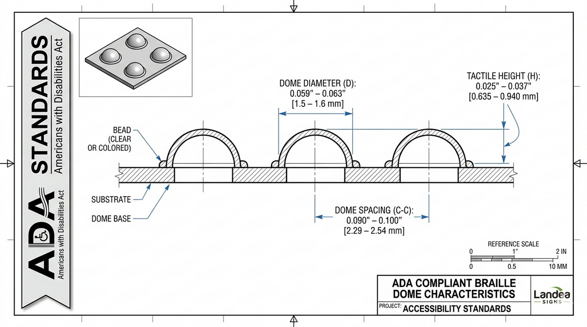
Before comparing aesthetics, we must understand the mechanics. Modern Braille signage typically utilizes the Raster Braille method. This involves drilling precise holes into a substrate (like acrylic, metal, or wood) and inserting tiny spheres—beads—into those holes.
Tactile Height: Beads must sit at a specific height (typically 0.025 to 0.037 inches) to be readable.
Structural Integrity: High-quality beads, whether glass, acrylic, or stainless steel, ensure the sign remains vandal-resistant.
Aesthetic Flexibility: This is where the choice between clear and colored beads comes in.

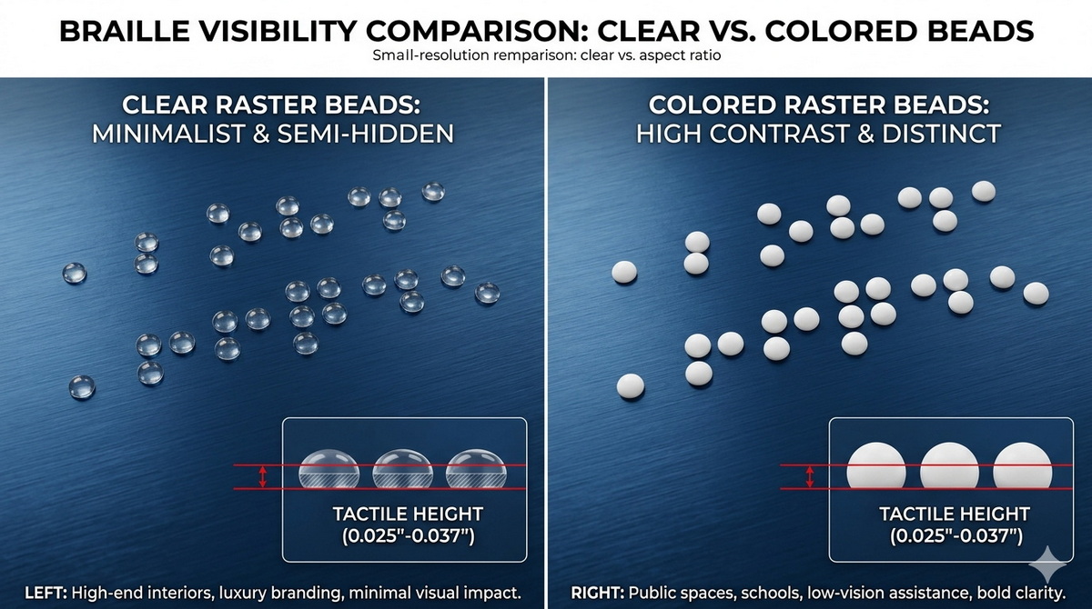
Clear beads are the industry favorite for high-end architectural projects where the sign's background design needs to remain uninterrupted.
Design Seamlessness: Clear beads allow the color or pattern of the substrate to show through. This is crucial for signs with complex gradients or brand-specific colors.
Reduced Visual Clutter: For sighted users, clear beads are almost invisible from a distance, making the printed text and pictograms the focal point.
Versatility: One stock of clear beads can be used across 100 different sign colors, simplifying the manufacturing process and ensuring consistency.
At Landea Signs, we've observed that while clear beads are "invisible," they still catch the light. This creates a subtle texture that many modern architects prefer for minimalist "Type A" environments.
Colored beads (white, black, grey, or custom metallic) are chosen when the Braille itself is intended to be a design element or when specific visual contrast is requested.
Visual Assistance: For individuals with low vision (who may not be fully blind), high-contrast Braille can actually help them locate the tactile area of the sign more quickly.
Brand Alignment: If a brand's palette involves high-contrast accents (e. g., a black sign with white accents), using white Braille beads reinforces the visual identity.
Ease of Inspection: From a facility management perspective, colored beads are much easier to inspect visually to ensure no "dots" have been lost or damaged.
| Feature | Clear Beads | Colored Beads |
| Visibility (Sighted) | Low / Minimalist | High / Distinct |
| ADA Compliance | Fully Compliant | Fully Compliant |
| Maintenance | Harder to see missing beads | Easy to spot missing beads |
| Material Options | Acrylic, Glass | Acrylic, Steel, Brass |
| Best For | Luxury Hotels, Art Galleries | Schools, Hospitals, Industrial |
A common misconception is that Braille must be a specific color to meet ADA (Americans with Disabilities Act) or ISO 17045 standards.
The Facts:
Contrast Requirements: ADA standards specify contrast for visual characters (text and icons), but they do not mandate a specific contrast ratio for Braille dots.
Tactile Priority: The law focuses on the shape, spacing, and height of the dots.
The "Landea Perspective": While visibility doesn't technically matter for compliance, it matters for User Experience (UX). If a low-vision user can see where the Braille is located from two feet away, their navigation becomes more efficient.
Most industry articles stop at "clear is for looks, colored is for sight." However, in 2026, we must consider Environmental Factors and Material Science.
The way your facility is lit changes how Braille is perceived.
Harsh Overhead Lighting: Can create glare on clear glass beads, making them "twinkle" and potentially distracting from the visual text.
Low Ambient Lighting: Colored beads (especially white on dark backgrounds) are significantly more helpful for navigation in dim corridors.
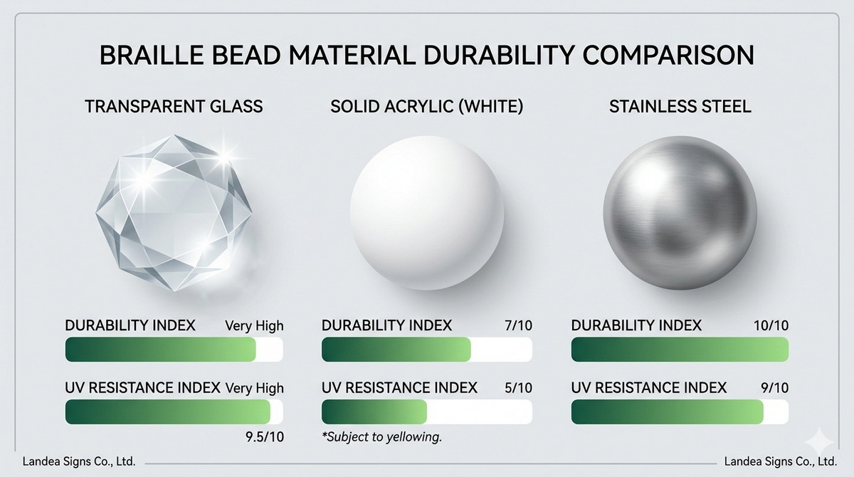
Glass Beads: Highly scratch-resistant and maintain clarity over decades.
Metal Beads: (Stainless Steel/Brass) Best for industrial settings or high-traffic public transit hubs where durability is the only priority.
Acrylic Beads: Cost-effective but can yellow slightly over time if exposed to high UV levels.
Recently, Landea Signs Co., Ltd. provided signage for a major tech hub in Toronto. The client was torn between clear beads and colored beads.
The Solution:
We implemented Translucent Matte Beads. These offer a middle ground—they are less reflective than clear glass (reducing glare) but less "loud" than solid white beads.
Outcome: 98% positive feedback from the accessibility audit.
Lesson: Customization is the future of signage. Don't feel locked into a binary choice.
Based on our manufacturing expertise, here is a quick guide to making the right choice:
Choose Clear Beads if: You have a high-end interior with custom-painted signs or wood veneers where you want the material's natural beauty to shine.
Choose Colored Beads if: You are designing for an inclusive environment like a hospital or school where "wayfinding assistance" (even visual) is a priority.
Choose Metal Beads if: The signs are outdoors or in an area prone to heavy wear and tear.
When we manufacture signs, we don't just look at the beads. We look at the system.
Hole Precision: We use CNC technology to ensure the bead is a "press-fit." A loose bead is a failed sign.
Surface Cleaning: Clear beads can trap dust during installation. We use ultrasonic cleaning to ensure no debris is visible under the sphere.
Standardization: We ensure Grade 2 Braille spacing is maintained regardless of bead color.
Does visibility matter? Yes, but not for the reasons you might think. It matters for the harmony of the environment and the subtle assistance of low-vision users.
At Landea Signs Co., Ltd., we believe that the best signage is felt before it is seen—but when it is seen, it should perfectly complement your brand's voice. Whether you choose the crystalline elegance of clear beads or the bold utility of colored ones, the key is precision and compliance.
Contact us to get more information!
Q1: Do clear Braille beads turn yellow over time?
A: If made from high-quality glass or UV-stabilized acrylic, they will not. Cheap plastic beads may yellow, which is why Landea Signs only uses architectural-grade materials.
Q2: Are colored beads more expensive?
A: Generally, no. The cost difference is negligible. The main "cost" is in the design decision and ensuring the color choice aligns with the overall sign contrast.
Q3: Can I mix clear and colored beads on one sign?
A: While technically possible, it is not recommended as it creates a confusing tactile and visual experience for the user. Consistency is key in wayfinding.
Q4: Does the bead color affect the "Braille Grade"?
A: No. "Grade 2 Braille" refers to the contraction of words and the layout of the dots, not the physical material or color of the beads.
Q5: Which is better for outdoor use?
A: For outdoors, we recommend Stainless Steel beads. They are impervious to weather and provide a distinct tactile feel that doesn't degrade with temperature fluctuations.
ADA Standards for Accessible Design (Section 703): https://www.ada.gov/law-and-regs/design-standards/
The Braille Authority of North America (BANA) - Signage Standards: http://www.brailleauthority.org/
ISO 17045:2014 - Passenger cars -- Relevant Braille Standards: https://www.iso.org/standard/59480.html
SEGD (Society for Experiential Graphic Design) Tech Talks on Braille: https://segd.org/
Landea Signs Internal Manufacturing Quality Report 2026.


