From idea to market-ready product, our SIGNS solutions make every stage easier, faster. Discover How We Help

Views: 229 Author: Landea Signs Publish Time: 2026-07-26 Origin: Site


Content Menu
● What These Two Sign Types Mean
● When Standard 8x8 Square Signs Work Best
● When Custom Shaped ADA Signs Add More Value
● Accessibility and Readability Considerations
● Design and Production Factors
● Why Buyers Choose Landea Signs
>> 1. Are custom shaped ADA signs harder to install?
>> 2. Are standard 8x8 square signs always more affordable?
>> 3. Which option is better for office interiors?
>> 4. Can a custom shaped sign still feel clear and professional?
>> 5. What is the best choice for a multi-location brand?
Choosing between custom shaped ADA signs and standard 8x8 square signs is not just a design decision. It affects readability, installation efficiency, brand presentation, and how well a sign supports everyday navigation in real spaces. For facility managers, architects, and sign buyers, the best choice depends on where the sign will be used, who will see it, and how much design flexibility the project requires.

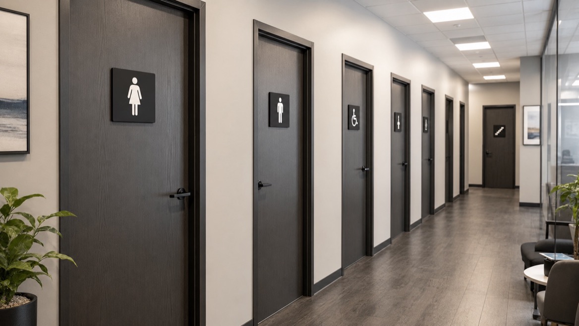
A standard 8x8 square sign is a compact, familiar format often used for room identification, directional messaging, or simple labels. It is easy to produce, easy to install, and often fits well into repeatable sign programs across offices, schools, medical buildings, and commercial spaces.
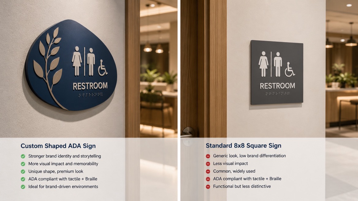
A custom shaped ADA sign uses a non-standard outline, such as a rounded rectangle, arch, circle, shield, wave, or brand-specific silhouette. These signs are often chosen when a project needs stronger visual identity, a more distinctive architectural fit, or a more premium interior finish. In many cases, the content still needs to remain highly legible and properly arranged for accessibility.
The key difference is simple: standard signs prioritize consistency, while custom shapes prioritize identity and flexibility. Standard 8x8 square signs work best when the goal is clear, repeated communication across many rooms or locations. Custom shaped signs work best when the environment needs to feel more branded, more modern, or more integrated with the interior design.
From a user experience standpoint, the right format is the one that helps people find information quickly without confusion. In public and commercial spaces, that often means the sign should be easy to recognize at a glance, easy to read from the expected viewing distance, and easy to mount in a predictable location.
Standard square signs are a strong choice when a project needs speed, budget control, and repeatability. They are especially effective in buildings with many similar rooms, such as offices, clinics, schools, warehouses, and multi-tenant properties.
They also help simplify production because the layout stays consistent across the entire sign family. This makes it easier to manage typography, spacing, tactile elements, and final installation.
Use standard square signs when you need:
- Fast production across multiple rooms or floors.
- Lower design complexity with fewer revisions.
- Consistent branding across a large facility.
- Simple replacement when a room name or tenant changes.
- Clear internal wayfinding in areas where function matters more than decorative shape.
Custom shaped ADA signs are the better fit when brand expression and architecture matter as much as function. A unique shape can make a reception area feel more polished, help a hospitality project feel more memorable, or align signage with a company's visual identity.
They are also useful when a building has unusual wall proportions, curved surfaces, or a premium interior design language. In those cases, a custom outline can make the sign feel intentional instead of generic.
Custom shaped signs are often the right choice for:
- Hotels and resorts with stronger visual storytelling.
- Corporate lobbies that need a branded first impression.
- Showrooms and visitor centers where image matters.
- High-end residential or mixed-use properties with refined interiors.
- Signature projects where the sign becomes part of the décor.
The shape of a sign should never reduce legibility. The most effective sign is not the most decorative one; it is the one that people can read quickly and correctly. For tactile or visual information, contrast, finish, character spacing, character size, and mounting position matter more than an unusual outline.
A custom shape can work well as long as the layout remains disciplined. The text should stay clean, the message should stay short, and decorative edges should not compete with the content. In practice, that means the shape supports the message instead of distracting from it.
Good sign design usually follows these principles:
- Use high-contrast text and background combinations.
- Keep wording short and direct.
- Avoid overly thin or ornate letterforms.
- Leave enough empty space around the message.
- Position the sign where users expect to look.
Production planning matters because custom shapes often require more setup than standard square signs. Tooling, routing, finishing, and material usage can all affect lead time and cost. For larger programs, even a small design change can increase labor across many signs.
Standard 8x8 square signs are usually easier to batch produce, which is why they remain popular for repeat installations. Custom shaped signs can deliver more visual impact, but they should be used where that extra value justifies the added complexity.
Before choosing, review:
1. How many signs are needed.
2. Whether rooms or tenant names may change often.
3. How much wall space is available.
4. Whether the sign must match a brand system.
5. Whether the project needs premium visual impact or simple efficiency.
The easiest way to choose is to match the sign format to the project goal. If the purpose is efficient room identification across a large building, standard square signs usually make the most sense. If the purpose is to strengthen identity in a visible customer-facing area, a custom shape is often the better investment.
| Project Need | Standard 8x8 Square Signs | Custom Shaped ADA Signs |
|---|---|---|
| Budget control | Strong | Moderate |
| Fast production | Strong | Moderate |
| Large multi-room systems | Strong | Moderate |
| Premium brand image | Moderate | Strong |
| Architectural integration | Moderate | Strong |
| Easy replacement | Strong | Moderate |
In 2026, more signage programs are moving toward functional branding: signs still need to guide people clearly, but they also need to reinforce the visual identity of the space. This is especially visible in interior signage, where companies want consistency across lobbies, corridors, conference rooms, and private offices.
That trend favors custom shapes in front-facing areas, while keeping standard formats in back-of-house and high-change spaces. A mixed system often performs best because it balances budget, usability, and brand value.
For most projects, the smartest approach is not to choose only one format. Instead, use standard square signs where consistency matters and custom shaped signs where the customer experience matters most. This hybrid strategy keeps the sign program efficient while still creating memorable moments in the right places.
A practical setup might look like this:
- Reception and lobby areas: Custom shaped signs.
- Conference rooms and office doors: Standard square signs.
- Directional and utility spaces: Standard square signs.
- Feature walls and brand zones: Custom shaped signs.
- Tenant-specific spaces: A format that can be updated easily.
At Landea Signs Co., Ltd., we focus on customized illuminated lettering and tailored signage solutions that help businesses communicate clearly while looking professional. For buyers who need both performance and brand presence, the right sign is one that aligns with the environment, the message, and the long-term use case.
If your project needs a sign system that feels intentional rather than generic, our team can help you compare formats, refine the layout, and build a solution that supports both function and presentation.
Custom shapes can take a little more planning because the mounting points and overall outline may differ from a standard square format. Once the installation plan is set, however, they are usually straightforward to mount.
They are often more cost-efficient because they are easier to produce in volume and simpler to standardize. Custom shapes may cost more depending on the outline, material, and finishing details.
Standard square signs are often better for offices with many repeated room labels. Custom shaped signs are better in reception areas, executive zones, or branded visitor spaces.
Yes, if the layout is controlled and the message is kept simple. The shape should enhance the sign, not overpower the text.
A mixed system usually works best. Standard signs keep the program consistent, while custom shaped signs can be reserved for high-visibility spaces.
- [Access Board – Chapter 7: Signs]
- [International Sign Association – ADA Accessible Signage]
- [Sign Research Foundation – Illuminated Sign Conspicuity]
- [Gemini Made – Signage Trends for Sign Businesses in 2026]
- [Cornell University – Best Practices for Creating Content for Your Digital Sign]


