From idea to market-ready product, our SIGNS solutions make every stage easier, faster. Discover How We Help

Views: 271 Author: Landea Signs Publish Time: 2026-07-15 Origin: Site


Content Menu
● Why Font Identification Matters In Modern Signage
● Understanding Font Families Used On Advertising Signage
● What The Original Font Quiz Gets Right – And Where It Stops Short
● A Practical Workflow For Matching Fonts On Existing Signs
● Lessons From Daily Font Questions In A Signage Workshop
● Case Study: Matching Fonts For A Multi‑Site Advertising Signage Rollout
● Practical Training Exercises Beyond Multiple‑Choice Quizzes
● Avoiding Common Mistakes In Font Choice For Advertising Signage
● Integrating Brand Guidelines With Font Identification
● How Signage Manufacturers Support Font Decisions
● Building Your Long‑Term Font Identification Skillset
In many organizations, the first "real" purchasing responsibility is ordering new nameplates, office signs, or badges for incoming staff. When the previous buyer leaves only partial notes, matching existing fonts and layouts can quickly turn into guesswork and delays. [searchengineland]
For manufacturers and signage specialists, font identification is not just a design detail; it is a practical skill that links brand consistency, legibility in different environments, and long‑term maintenance costs. From our daily work at Landea Signs Co., Ltd., we see that teams who understand basic typeface families make fewer mistakes, avoid miscommunication with vendors, and maintain a cleaner visual system across facilities and branches. [semrush]
Most signage typography falls into a few major font families that strongly influence how your sign is perceived and how easily it can be read at a distance. [semrush]
- Serif fonts
These typefaces have small finishing strokes at the ends of letters and often feel traditional, formal, or institutional. They work well for engraved plaques, institutional facilities, and branding that aims to convey heritage or stability, but can be harder to read at long distances on backlit advertising signage. [searchengineland]
- Sans‑serif fonts
These fonts have clean, straight strokes without decorative endings and dominate modern advertising signage because they stay clear and legible when scaled up or illuminated. Helvetica, Arial, Futura and similar typefaces are common choices for channel letters, window graphics, and wayfinding systems. [searchengineland]
- Script and decorative fonts
Script fonts mimic handwriting, while decorative fonts are highly stylized for impact. They can add personality to logos or headlines but should be used carefully for functional signs, since readability drops quickly in low‑light or high‑speed viewing environments. [semrush]
When you stand in front of a sign, your first step is to mentally classify it: does it look more like an elegant printed book title (serif), a clean digital interface label (sans‑serif), or handwriting/artwork (script/decorative)? That initial classification dramatically narrows your search for the specific typeface. [searchengineland]
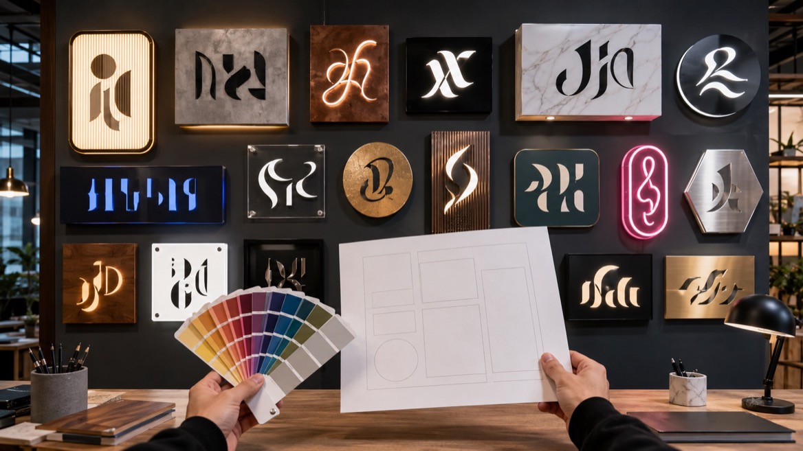
The "Name That Font" quiz from Office Sign Company introduced a fun, practical way for buyers and designers to test their ability to recognize common fonts like Times New Roman, Friz Quadrata, Helvetica, and Calibri. It framed a realistic purchasing scenario and turned font matching into a game with graded results from A through F. [searchengineland]
However, the quiz focuses mainly on multiple‑choice recognition rather than on the decision‑making process behind signage typography. It does not explain how font choice impacts viewing distance, lighting conditions, or material constraints, nor does it provide a step‑by‑step method for matching fonts on real projects where you may not have answer options to choose from. [searchenginejournal]
In our experience as signage manufacturers, buyers need more than a quiz score: they need a workflow they can repeat for every project, plus clear guidance on when close matches are acceptable and when exact matches are critical for brand compliance. [semrush]
When you receive a request to extend or update existing signage, you can follow a simple five‑step process to identify the font used and maintain visual consistency. [semrush]
1. Capture a clear image of the sign.
Take a straight‑on photo in good lighting, avoiding extreme angle distortions. This image will be your reference for analysis and for any font‑matching tools. [semrush]
2. Classify the font family.
Ask whether the letters have small decorative endings (serif), clean strokes (sans‑serif), handwriting characteristics (script), or heavy stylization (decorative). This immediately filters your options. [searchengineland]
3. Study key letter shapes.
Look closely at letters like "a," "g," "R," "S," and "e." Many fonts have distinctive designs for these characters that make identification much easier than focusing only on straight strokes. [searchengineland]
4. Compare spacing and weight.
Notice whether the letters appear condensed or wide, light or bold, and how much space sits between letters. Two fonts can share similar shapes but differ strongly in spacing and stroke weight. [searchengineland]
5. Use professional matching tools and vendor expertise.
Upload your image to font‑matching platforms or send it to your signage manufacturer for expert review. Experienced production teams and designers often recognize commonly used typefaces on sight because they encounter them daily in engraving, printing, and fabrication workflows. [semrush]
This process works whether you are matching office nameplates, illuminated exterior signs, or temporary event graphics. Over time, the repetition builds your own pattern recognition, similar to what the original quiz aims to train. [searchengineland]
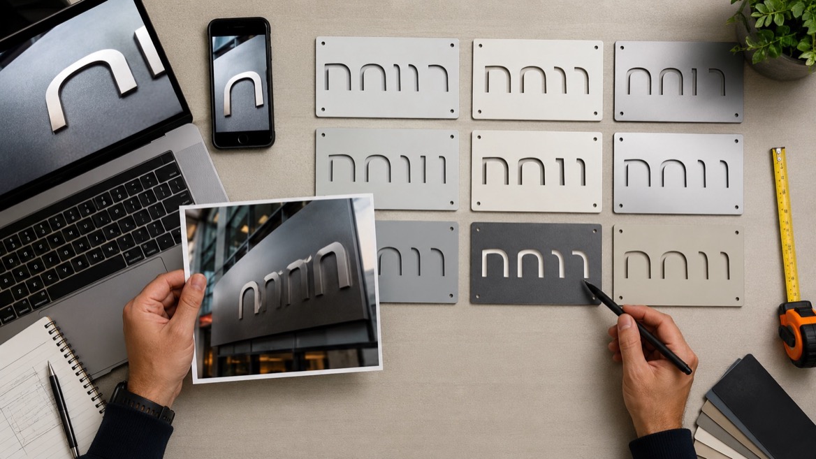
In a typical week at a signage manufacturer, many inquiries revolve around "unknown fonts" on existing panels, directories, and advertising displays. Common scenarios include regional offices needing new names added to a standard template, franchised retail stores requesting localized signs that still match head‑office branding, or industrial plants adding new departments to long‑standing wayfinding systems. [semrush]
Based on these conversations, several recurring themes emerge:
- Buyers often have high brand standards but lack formal typography training.
- Internal documents may reference "standard office font" without specifying the exact typeface.
- Close visual matches can be acceptable for internal signage, but external advertising signs tied to a registered trademark usually require precise font reproduction. [semrush]
By sharing process screenshots, sample plates, and practical before‑and‑after comparisons, signage teams help purchasers move from vague descriptions like "that clean modern font we used last time" to precise choices that fabrication teams can reproduce accurately. [semrush]
Consider a multi‑site advertising campaign for a manufacturing brand that uses illuminated pylons and wall signs across several industrial parks. Each site needs new units, but existing signs were produced years ago with incomplete records. [semrush]
The designated buyer starts by photographing each sign, then compares letter shapes and spacing to common sans‑serif fonts used in large‑format fabrication. After classifying the typeface as a geometric sans‑serif similar to Futura, they send images to the signage manufacturer, who evaluates stroke terminations and letter widths across several test outputs. [searchengineland]
After a few iterations, the manufacturer confirms a close match and produces sample panels for on‑site comparison. The buyer approves the match based on physical inspection under night lighting and daytime viewing, ensuring that the campaign remains visually unified across locations. This approach balances technical precision with practical constraints, and it relies heavily on the combined experience of the buyer and the signage workshop. [semrush]

Multiple‑choice quizzes are excellent for introducing fonts, but they should be supplemented with real‑world exercises for buyers and facility managers. [searchengineland]
Here are three effective practice methods:
- Side‑by‑side printouts.
Print the original sign text and several candidate fonts at similar sizes. Compare curves, letter widths, and spacing physically rather than on screen. This improves your eye for subtle differences. [searchengineland]
- Single‑letter focus drills.
Create a sheet showing the same letter (for example, "R" or "G") in multiple fonts. Train yourself to notice unique features such as leg shapes, terminals, or bowl shapes. [searchengineland]
- Material simulation.
Ask your manufacturer to produce small test strips with different fonts on the actual material you use, such as acrylic, aluminum, or vinyl. Seeing fonts on real substrates helps you understand how they behave under fabrication constraints. [semrush]
These exercises convert passive recognition into active understanding, which is more valuable when you face complex purchasing decisions without predefined answer options.
Even experienced teams occasionally select fonts that look attractive in a design file but perform poorly in actual advertising environments. The most frequent issues include: [semrush]
- Using thin, light weights for illuminated outdoor signs where brightness washes out detail.
- Choosing condensed fonts for long facility names, resulting in crowded letters that are difficult to read from a distance.
- Applying intricate script fonts for essential informational text instead of limiting them to logos or secondary decorative elements. [semrush]
A simple rule of thumb is that functional text on advertising signage should remain clear at a glance from the intended viewing distance and under typical lighting. Aesthetic considerations are important, but they should not override legibility and safety. [semrush]
Many organizations maintain brand manuals that specify primary and secondary fonts, yet these documents do not always reach procurement or facilities teams. Before attempting to identify fonts visually, ask your marketing or branding department whether official typefaces are documented. [semrush]
Once you know the approved fonts, every new signage project should start by verifying whether the existing sign uses those fonts or a legacy alternative. If the signage predates current brand standards, you can decide whether to maintain the older typeface for consistency on site or transition to the new brand fonts for all future installations. [semrush]
In either case, collaborating with marketing ensures that font decisions on advertising signage support long‑term brand strategy instead of being driven purely by convenience or local preferences. [semrush]
Professional signage manufacturers combine design expertise, production knowledge, and practical experience with common fonts and materials. In daily operations, they: [semrush]
- Review customer photos or artwork files to pinpoint likely typefaces.
- Suggest alternative fonts when licensing or fabrication constraints make the original choice impractical.
- Test readability under specific conditions such as night‑time illumination, reflective surfaces, or long hallway viewing distances. [semrush]
By treating font identification as a collaborative process, buyers can rely on manufacturer insights instead of working in isolation. This partnership reduces revision cycles, ensures technical feasibility, and strengthens the overall quality of the finished advertising signage. [semrush]
Developing a strong eye for typography takes practice, but it pays off quickly in smoother projects and more cohesive visual environments. A realistic personal development plan might include: [ikf.co]
- Reviewing a small set of widely used fonts each month and noting their distinctive letter shapes.
- Keeping a simple internal reference file of fonts used on different signage programs for your company.
- Recording which fonts perform best on specific materials and viewing conditions, based on past installations. [ikf.co]
Over time, your role shifts from "guessing the font" to confidently documenting and specifying typefaces that align with brand guidelines and fabrication realities. The original quiz can be a starting point, but the true goal is to become a reliable internal resource for typography decisions on advertising signage projects. [ikf.co]
1. How do I start identifying a font if I only have a photo of an old sign?
Begin by taking a clear, straight‑on photo, then classify the font as serif, sans‑serif, script, or decorative before comparing key letter shapes like "a," "g," and "R" to common typefaces.
2. When is an exact font match essential for signage projects?
Exact matches are crucial for trademarked logos, branded advertising signage, and standardized corporate programs where typography is part of the legal and visual identity system.
3. Can I replace a legacy font with a modern alternative on existing facility signs?
Yes, but it is best to coordinate with your branding team and signage manufacturer to minimize visual disruption and ensure that the new font remains readable in the same conditions.
4. What should I do if my brand manual doesn't list any fonts?
Work with marketing to define primary and secondary typefaces, then apply them consistently across new signage while documenting choices so future buyers can reference your decisions.
5. Are decorative fonts suitable for wayfinding and safety signs?
Decorative typefaces are generally better reserved for headlines or logos, while functional wayfinding and safety information should use clear, high‑contrast fonts designed for quick reading.
1. Office Sign Company Blog – "Name That Font Quiz – Office Sign Company Blog" – [https://blog.officesigncompany.com/name-that-font-quiz/] [searchengineland]
2. Search Engine Land – "An SEO guide to understanding E‑E‑A‑T" – [https://searchengineland.com/guide/google-e-e-a-t-for-seo] [searchengineland]
3. Semrush – "Google E‑E‑A‑T: What it is & how it affects SEO" – [https://www.semrush.com/blog/eeat/] [semrush]
4. Search Engine Journal – "How To Apply E‑E‑A‑T To Your Site & Boost On‑Page SEO" – [https://www.searchenginejournal.com/on-page-seo/eat-ymyl/] [searchenginejournal]
5. IKF – "Google E‑E‑A‑T in SEO: Increase Your Website Credibility" – [https://www.ikf.co.in/blog/google-eeat-seo-guide/] [ikf.co]


