From idea to market-ready product, our SIGNS solutions make every stage easier, faster. Discover How We Help

Views: 282 Author: Landea Signs Publish Time: 2026-08-24 Origin: Site


Content Menu
● What Makes a Tactile Sign Functional?
● Photopolymer Signs: One Integrated Tactile Surface
>> How Photopolymer Sign Fabrication Works
>> Key Advantages of Photopolymer Signs
>> Photopolymer Sign Limitations
● Raster Braille Signs: Separate Dots, Flexible Appearance
>> How Raster Braille Sign Fabrication Works
>> Key Advantages of Raster Braille Signs
>> Raster Braille Sign Limitations
● Photopolymer Signs vs. Raster Braille Signs
● Choosing by Installation Environment
>> Outdoor and Exposed Locations
>> Healthcare and Care Environments
>> Schools, Transit, and Public Buildings
>> Hospitality, Retail, and Corporate Interiors
● A Practical Specification Checklist
● Expert Perspective: Design for Lifecycle, Not Day One
● Build a Sign System That Lasts
● FAQ
>> 1. Are photopolymer signs better than raster Braille signs?
>> 2. Can raster Braille signs be used outdoors?
>> 3. Do all room signs need Braille?
>> 4. What type of Braille is used on accessible signs?
>> 5. Can Braille dots be a different color from the sign background?
>> 6. Which tactile sign type is best for hospitals?
>> 7. How should tactile signs be installed?
Choosing between photopolymer signs and raster Braille signs is not simply a matter of appearance or unit price. The fabrication method affects tactile performance, environmental resistance, cleaning suitability, maintenance exposure, and the long-term reliability of every raised character and Braille dot.
At Landea Signs Co., Ltd., we approach Braille sign projects as an accessibility and lifecycle decision. A sign may look excellent when installed, but the right tactile sign system must also remain readable, securely constructed, and appropriate for its real operating environment years later. This guide compares photopolymer signs and raster Braille signs in practical terms, helping architects, contractors, facility managers, and sign buyers select the right solution for indoor, outdoor, healthcare, hospitality, education, and public-use projects.
> Quick recommendation: Choose photopolymer signs when durability, frequent cleaning, outdoor exposure, and tamper resistance matter most. Choose raster Braille signs when the installation is reliably indoor and the project prioritizes visual flexibility, premium materials, or distinctive Braille-dot finishes.

A tactile sign communicates through more than printed graphics. It uses raised characters and Braille that users can locate and read by touch, while also providing visual information for people with partial sight.
In U.S. accessibility standards, tactile signs are generally required where permanent rooms and spaces are identified, along with certain exit, elevator, and transportation applications. Required tactile information includes raised characters and contracted Grade 2 Braille. Surface finish, visual contrast, character shape, Braille geometry, and mounting location also affect whether a sign is usable in practice.
A reliable Braille sign system must deliver four things:
- Tactile clarity: Raised letters and dots must be consistently formed and comfortable to read.
- Mechanical security: Components must remain attached despite touch, cleaning, impact, and normal wear.
- Visual legibility: Contrast and non-glare surfaces help low-vision users find and interpret the sign.
- Correct installation: A high-quality sign can still fail its purpose if mounted at the wrong height or in an obstructed location.
The U.S. Access Board specifies a mounting range of 48 to 60 inches above the finished floor or ground, measured from tactile character baselines.
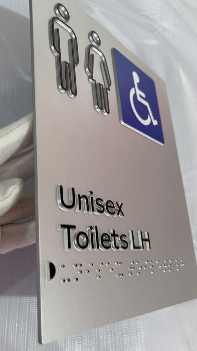
Photopolymer signs use a UV-sensitive polymer process to create raised letters, symbols, and Braille directly as part of the sign face. A negative film image is used during UV exposure, after which the background is removed or developed to leave the tactile copy raised above the surface.
The key distinction is structural: the tactile elements are formed as an integrated surface rather than added one dot at a time after the sign panel has been manufactured.
Although production details vary by supplier and material system, the standard workflow usually includes:
1. Preparing compliant artwork with raised text, pictograms, and Braille.
2. Creating a film negative or digital exposure file.
3. UV-exposing a photosensitive substrate.
4. Developing the material to reveal raised tactile elements.
5. Applying color, protective coatings, and the chosen mounting system.
6. Inspecting tactile height, Braille detail, color contrast, and finish quality.
The process can create precise raised information from artwork while keeping tactile text and Braille integral to the sign face.
Integrated construction is the main advantage. Raised copy and Braille dots are not separate beads pressed into drilled holes. This reduces the number of potential component-failure points.
Photopolymer signs are particularly strong where signs receive frequent contact, aggressive cleaning, or environmental exposure. Industry guidance notes that the top-coated surface can help seal the sign face, a useful characteristic in medical environments with rigorous cleaning procedures.
Other advantages include:
- Better resistance to attempts to pry out individual Braille dots.
- A smooth, unified sign surface with no individual bead-to-panel junctions.
- Strong suitability for high-traffic public environments.
- Potentially lower lifecycle maintenance where replacement labor is expensive.
- Compatibility with detailed tactile copy, room names, pictograms, and wayfinding systems.
- An effective option for exterior-grade accessible signs when specified with suitable outdoor materials and finishes.
Photopolymer signs also involve design trade-offs.
Because the Braille dots are formed from the same tactile system as the raised lettering and sign face, the project may have less freedom to create a contrasting metallic, transparent, or jewel-like Braille-dot effect. The final visual outcome depends heavily on coating choices, color specification, substrate, and manufacturing capability.
For luxury hospitality, boutique retail, or branded corporate interiors, some designers prefer the distinctly separate appearance that raster Braille beads can provide. That is an aesthetic preference—not necessarily a durability advantage.
Raster Braille signs are produced by drilling precisely positioned holes into a sign panel and inserting individual Braille beads. The beads may be acrylic, transparent polymer, stainless steel, brass, or another compatible material, depending on the supplier and project specification.
This is a modular construction method. The sign panel and Braille dots are separate physical elements.
The typical raster Braille process includes:
1. Engraving, printing, or otherwise preparing the sign face.
2. Drilling accurately spaced holes for each Braille dot.
3. Selecting the required Braille bead material and color.
4. Pressing or inserting individual beads into the holes.
5. Inspecting dot height, location, retention, tactile readability, and overall finish.
Industry descriptions characterize raster Braille as a rotary engraving approach in which holes are drilled into an acrylic substrate and spheres are inserted to form the raised dots.
Raster Braille signs are popular because they offer visible design flexibility. Since dots can be selected independently of the sign panel, a manufacturer can create combinations that are difficult to achieve with an integrated process.
Common possibilities include:
- Clear Braille dots on a colored acrylic background.
- White or black high-contrast dots.
- Stainless-steel dots for a contemporary finish.
- Brass or rose-gold-look dots for upscale interiors.
- Dots matched to the sign background for a restrained visual effect.
- Decorative sign faces using acrylic, metal laminates, wood-look materials, or layered construction.
This flexibility can make raster Braille signs especially attractive for interior projects such as hotels, premium offices, retail stores, showrooms, apartments, and branded workplace environments.
The main consideration is the connection between each dot and the sign panel. Every Braille dot is an independent inserted piece. With proper fabrication, quality materials, and appropriate indoor use, raster Braille signs can perform well. However, buyers should understand that the system contains individual components rather than one continuous tactile surface.
A sign installed in a high-contact setting may experience pulling, scratching, cleaning pressure, baggage impact, vandalism, or temperature and moisture changes. In these conditions, the performance of the drilled hole, bead, insertion method, adhesive—if used—and substrate becomes important.
This does not mean raster Braille signs are inherently unsuitable. It means they should be specified for the environment rather than selected only because they look premium.
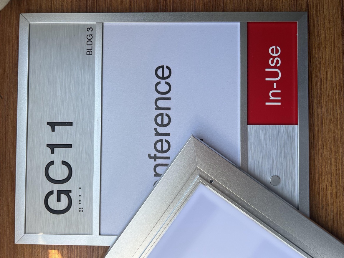
| Selection factor | Photopolymer signs | Raster Braille signs |
|---|---|---|
| Tactile construction | Raised copy and Braille are integrated into the sign surface | Braille dots are individual beads inserted into drilled holes |
| Braille-dot styling | Usually coordinated with the integrated tactile surface and coating system | Broad choice of clear, colored, acrylic, stainless steel, brass, or decorative dots |
| Tamper resistance | Strong, because there are no separate individual dots to extract | Depends on bead retention, substrate, installation environment, and physical abuse |
| Frequent cleaning | Well suited when specified with an appropriate durable coating | Suitable for normal indoor cleaning, but repeated harsh cleaning deserves material testing |
| Outdoor use | Preferred for demanding outdoor or exposed applications when exterior-grade materials are specified | Use only after confirming material compatibility, bead retention, sealing, and environmental suitability |
| High-traffic spaces | Strong choice for hospitals, schools, transit, and public buildings | Better reserved for controlled indoor spaces unless engineered for the specific risk level |
| Luxury interior styling | More focused on durability and integrated tactile appearance | Strong option for custom finishes and decorative visual expression |
| Maintenance planning | Often lower-risk because tactile elements are integral | Include inspections for dot security, especially in public-touch locations |
| Best-fit applications | Exterior, healthcare, education, transit, public facilities | Hotels, offices, retail, apartments, showrooms, controlled interiors |
The best sign system begins with the installation environment, not the product catalog.
For exterior entrances, parking structures, campus routes, transport areas, pool zones, exposed corridors, and other weather-affected locations, photopolymer signs are often the safer specification.
Outdoor signs may face UV exposure, wind-driven rain, pollutants, wide temperature swings, accidental impact, and more intentional abuse than interior signs. Exterior-grade photopolymer products are designed for long-term exposure across broad climate conditions when the correct material and finish are used.
For these applications, ask the supplier about:
- Exterior substrate and coating specification.
- UV resistance and color stability.
- Corrosion resistance of the panel and mounting hardware.
- Edge sealing and water-management details.
- Cleaning chemical compatibility.
- Warranty scope and exclusions.
Hospitals, clinics, laboratories, senior-living facilities, rehabilitation centers, and emergency departments create a different challenge: repeated touch plus frequent cleaning.
Photopolymer signs are often a practical choice because their tactile elements are integrated, and coated surfaces can better support a cleaning-focused maintenance routine.
However, material selection must still be verified. "Easy to clean" is not the same as "resistant to every disinfectant." Buyers should provide the expected cleaning agents, dilution method, frequency, and dwell time to the sign manufacturer before approving samples.
Schools, universities, airports, rail stations, government buildings, stadiums, and public service facilities often experience high touch frequency and occasional abuse. In these settings, the cost of a failed sign includes more than replacement—it can disrupt wayfinding and create an accessibility issue.
For permanent room identification and other required tactile applications, raised characters and contracted Grade 2 Braille are central requirements under the ADA Standards. An integrated photopolymer sign system is usually the more conservative selection where heavy use and long-term durability are priorities.
Raster Braille signs can be an excellent choice in stable, dry interiors where design expression matters. A luxury hotel may use brushed-metal faces with matching metal Braille dots. A technology company may use clear dots on a deep matte background. A retail showroom may choose custom colors that align with its brand environment.
The important condition is that design should not compromise tactile usability. Braille should remain properly positioned, consistently formed, and separated from raised borders or decorative elements. Guidance for ADA Braille sign design notes that Braille should be placed below the corresponding text and separated from other tactile elements.
Before placing an order, use this decision sequence.
1. Classify the location. Is it outdoor, semi-outdoor, wet, high-touch, public, controlled, or decorative?
2. Identify the required tactile content. Confirm room names, numbers, pictograms, directional information, and Grade 2 Braille requirements.
3. Review code requirements early. For U.S. projects, permanent room and space identification signs are among the applications that require tactile information.
4. Choose the construction method. Use photopolymer signs for integrated durability. Consider raster Braille signs for protected interiors requiring specialized visual finishes.
5. Specify contrast and finish. A non-glare finish and sufficient visual contrast support people with low vision.
6. Test cleaning compatibility. Provide cleaning-product information and request material recommendations or test samples.
7. Confirm mounting conditions. Verify wall surface, door clearance, mounting height, hardware, and the ability to maintain a clear approach area.
8. Approve a production sample. Check spelling, Braille translation, raised height, dot quality, color, finish, edge treatment, and mounting method before mass production.
In real projects, the wrong tactile sign choice often becomes obvious only after installation. A sign may initially look refined but prove unsuitable after months of cleaning, contact, humidity, or public use. Conversely, a highly durable sign may be over-specified for a low-contact executive suite that needs a more premium decorative result.
The better approach is to match the system to risk.
- Select photopolymer signs when accessibility information must endure high contact, outdoor weather, strong cleaning routines, or potential tampering.
- Select raster Braille signs when the setting is genuinely controlled, indoor, dry, and design-driven—and when periodic inspection is realistic.
- Do not assume that a material alone determines performance. Substrate, coating, bead retention, mounting method, cleaning routine, and installation conditions all matter.
A durable tactile sign is not merely a compliance item. It is a long-term part of the building's navigation infrastructure.
The best tactile sign system balances accessibility, architectural appearance, maintenance demands, and real environmental risk. Landea Signs Co., Ltd. can help you evaluate photopolymer signs and raster Braille signs based on your drawings, project location, material preferences, cleaning routine, and target market requirements.
Send us your sign schedule, artwork, installation photos, or project specifications for a tailored tactile sign recommendation and production quotation.
Neither is universally better. Photopolymer signs are generally the stronger choice for high-traffic, exterior, healthcare, and public applications because the raised tactile information is integrated into the sign. Raster Braille signs are often preferred for protected indoor spaces where decorative dot materials and visual customization are important.
They can be considered only if the manufacturer confirms that the sign panel, beads, retention method, coatings, edges, and mounting system are engineered for the expected outdoor conditions. For demanding exterior applications, photopolymer signs are typically the lower-risk option.
Not every sign has the same tactile requirement. Under U.S. accessibility standards, tactile requirements apply to signs identifying permanent rooms and spaces, as well as certain exit, elevator, and transportation signs. Temporary signs, addresses, and directories are among the listed exemptions.
For applicable U.S. tactile signs, the required Braille is contracted, also known as Grade 2 Braille.
Yes. Raster Braille signs make this especially easy because the dots are separate components that can be selected in transparent, contrasting, metallic, or matching finishes. In photopolymer signs, the visual result is more dependent on the integrated material and coating system.
Photopolymer signs are often the better choice for hospitals because their integrated raised elements are well suited to high touch frequency and rigorous cleaning environments. The specific sign material should still be matched to the facility's cleaning chemicals and maintenance process.
For U.S. projects, tactile characters must be mounted within the required 48-to-60-inch range above the finished floor or ground surface, measured from the specified tactile-character baselines. Placement should also allow users to approach and locate the sign safely.
1. U.S. Access Board. "[Chapter 7: Signs]." ADA Accessibility Standards guide. Accessed August 2026.
2. U.S. Access Board. "[ADA Accessibility Standards]." Official accessibility standards and technical requirements. Accessed August 2026.
3. Park Place Sign Systems. "[ABC's of ADA – An Introduction to Tactile Signage]." Manufacturing overview of raster Braille and photopolymer tactile sign methods. Published September 20, 2024.
4. Nova Polymers. "[What Are the ADA Braille Signage Requirements?]." Practical overview of tactile character, Braille, spacing, and mounting considerations. Published April 15, 2025.
5. ADA Central. "[Photopolymer Signs vs. Raster Braille Signs]." Comparison of sign construction and cleaning considerations.
6. Nova Polymers. "[Exterior-Grade Photopolymer for ADA Signs]." Overview of exterior photopolymer sign durability considerations.


