From idea to market-ready product, our SIGNS solutions make every stage easier, faster. Discover How We Help

Views: 218 Author: Landea Signs Publish Time: 2026-09-17 Origin: Site


Content Menu
● Why Restaurant Signage Matters Before Guests Enter
● Start With the Restaurant's Brand Positioning
>> Match the Sign Style to the Dining Experience
● Design Restaurant Signs for Real Viewing Conditions
>> Calculate Viewing Distance Before Finalizing Letter Size
>> Use Contrast Before Color Trends
>> Select Typefaces That Work at a Distance
● Choose Restaurant Sign Types by Customer Journey
● Select Materials for Appearance and Long-Term Value
● Plan Lighting for Night Visibility Without Glare
>> Choose the Right Illumination Method
● Build Accessibility Into the Sign System
● Check Sign Permits Before Production
● A Practical Restaurant Sign Design Checklist
● Work With a Custom Restaurant Sign Manufacturer
>> What is the best type of sign for a restaurant?
>> How large should restaurant sign letters be?
>> Should a restaurant use illuminated signage?
>> What information should appear on an exterior restaurant sign?
>> Are Braille signs required in restaurants?
>> How can I make my restaurant sign more visible at night?
>> What should I provide to a custom sign manufacturer?
A restaurant sign is not simply a name above a door. It is the first physical interaction many guests have with your brand—often viewed for only a few seconds from a moving car, a parking lot, or a crowded sidewalk. The most effective restaurant signs combine clear brand positioning, distance-based readability, durable fabrication, responsible illumination, and an intuitive guest journey.
For restaurant owners, franchise teams, architects, and hospitality designers, the goal is not to make the loudest sign. It is to create a sign system that helps the right people notice the restaurant, understand what it offers, feel confident about entering, and navigate the space with ease.
At Landea Signs Co., Ltd., we develop customized advertising signage solutions for restaurants and food-service brands. This guide shares the design principles our signage specialists use when turning a restaurant concept into a practical, memorable, and production-ready visual experience.

Customers begin forming an opinion of a restaurant before they read a menu or speak to a team member. The exterior logo, storefront letters, window graphics, lighting, parking signs, and entrance directions work together to communicate what kind of experience awaits inside.
A refined steakhouse, a busy quick-service restaurant, a specialty coffee shop, and a family-friendly hotpot restaurant should not use the same visual language. Their customers have different expectations, visit at different times, and make decisions at different speeds.
A strong restaurant signage design system should answer several questions quickly:
- What is this restaurant called?
- What type of food, drink, or experience does it offer?
- Where is the entrance, pickup counter, parking area, or outdoor seating?
- Is the restaurant open now?
- Can guests read the sign during daytime, nighttime, rain, or heavy street traffic?
- Does the visual identity feel consistent with the food, price point, and atmosphere?
The original competitor article correctly highlights visual message, size, shape, and visibility. However, it leaves important practical gaps. It does not explain how to design for different viewing distances, how to build a complete customer journey, how to prepare for approval requirements, or how materials and lighting affect long-term operating value.
An effective restaurant sign program must solve these real-world issues before production begins.
The best restaurant signage begins with brand strategy rather than decoration. Before choosing an acrylic letter, illuminated logo, LED neon sign, or pylon structure, define the restaurant's personality and commercial objective.
Your signage should make a promise that the interior experience can keep.
For example:
- A premium Japanese omakase restaurant may use restrained typography, warm halo-lit letters, dark metal finishes, and subtle bilingual wayfinding.
- A casual burger restaurant may benefit from bold colors, larger lettering, energetic wall graphics, and highly visible drive-through or pickup signs.
- A bakery or café may use softer colors, custom-shaped hanging signs, hand-drawn illustration details, and inviting window messaging.
- A late-night bar or dessert shop may require controlled neon, backlit channel letters, and a strong nighttime focal point.
Consistency creates recognition. When the exterior sign, menu boards, uniforms, wall décor, packaging, and social-media imagery share the same visual direction, guests are more likely to remember the venue and identify it again.
A common design mistake is attempting to communicate everything on one sign. A restaurant name, logo, menu categories, promotions, social-media handles, opening hours, delivery platforms, phone numbers, and decorative images can create visual overload.
For exterior restaurant signs, prioritize information in this order:
1. Restaurant name or logo
2. Primary cuisine or category cue
3. A short differentiator, if needed
4. Directional information
5. Secondary details only where guests have time to read them
A roadside sign may need only the name and cuisine cue, such as "SORA RAMEN" and "Japanese Noodles." A sidewalk sign can carry one daily promotion. A pickup counter sign can provide detailed operational instructions.
The farther away guests are from the sign, the simpler the message should be.
A beautiful sign in a design presentation can fail outdoors if it is too small, too busy, poorly lit, or blocked from the most common approach angle. This is why experienced sign manufacturers evaluate location before finalizing artwork.
Letter size should reflect how far away customers need to read the message. A widely used baseline is approximately 1 inch of letter height for every 10 feet of viewing distance. A restaurant sign intended to be read from 30 feet away, for example, should generally use letters around 3 inches high as a starting point.
This is not a fixed rule for every location. Speed of traffic, typeface weight, color contrast, illumination, weather, and sign placement all influence readability.
| Viewing situation | Main guest need | Recommended sign approach |
|---|---|---|
| Across a street or parking lot | Identify the restaurant early | Large logo, short wording, strong contrast, illuminated letters |
| Approaching on foot | Confirm entrance and offer | Brand name, opening status, one concise message |
| At the entrance | Find the correct door or queue | Clear directional arrows, accessibility cues, pickup and dine-in separation |
| At the counter | Make ordering easier | Structured menu boards, readable pricing, minimal decorative clutter |
| Inside the dining area | Support the experience | Subtle décor signs, restroom signs, wayfinding, branded moments |
For high-traffic roads, vehicle speed creates an additional challenge. Drivers need enough time to notice, interpret, and react safely. A large restaurant pylon sign may be appropriate in some commercial settings, while a projecting blade sign may be more effective on a pedestrian-oriented street.
Color is powerful, but contrast is what helps guests read a sign quickly. A low-contrast sign may look fashionable in a close-up photograph but become difficult to read under bright sunlight, at night, or through a vehicle windshield.
Use these practical principles:
- Choose a light-on-dark or dark-on-light text relationship.
- Avoid placing vital text directly over busy photography or textured backgrounds.
- Keep the restaurant name more prominent than secondary messages.
- Test color combinations under daylight and nighttime lighting.
- Use a limited color palette to reduce visual noise.
- Reserve highly saturated colors for emphasis, not every element.
For standard text, a 4.5:1 contrast ratio is a common accessibility baseline; large text can use a lower threshold, but higher contrast generally improves long-distance comprehension.
Restaurant owners often choose fonts based only on personality. Personality matters, but legibility must come first.
A decorative script may be appropriate for a logo mark, but it should not carry critical wayfinding or operational instructions. Likewise, an ultra-thin font may disappear when illuminated or viewed from across a parking area.
For most functional restaurant signage:
- Use clean, well-spaced letterforms.
- Limit the number of font families.
- Avoid compressed lettering for key brand names.
- Use sufficient stroke width for illuminated letters.
- Test uppercase and lowercase combinations at final scale.
- Make arrows, restroom labels, pickup instructions, and safety messages immediately understandable.
Readable signage feels effortless. Guests should not need to stop, squint, or ask where to go.
A complete restaurant signage plan is more effective than treating the storefront sign as a standalone purchase. Guests move through a sequence: they notice the location, enter the site, find the door, understand how to order, locate facilities, and leave with a lasting brand impression.
Exterior signs create awareness and establish the restaurant's first impression. Common options include:
- Front-lit channel letters for bright, highly visible branding.
- Halo-lit letters for a premium, architectural appearance.
- Acrylic logo signs for clean storefront applications.
- Cabinet signs for businesses that need large-format graphic visibility.
- Blade signs for narrow sidewalks and pedestrian streets.
- Monument signs for entrances, plazas, and stand-alone restaurants.
- Pylon signs for roadside visibility in retail or highway environments.
- LED neon signs for distinctive nightlife, cafés, dessert brands, and photo-friendly features.
- Awning graphics for compact storefronts and weather protection.
The right choice depends on façade conditions, viewing distance, local restrictions, target audience, and budget—not simply on current visual trends.
Interior signs help the restaurant operate smoothly and make the guest experience more comfortable.
Useful interior restaurant signage may include:
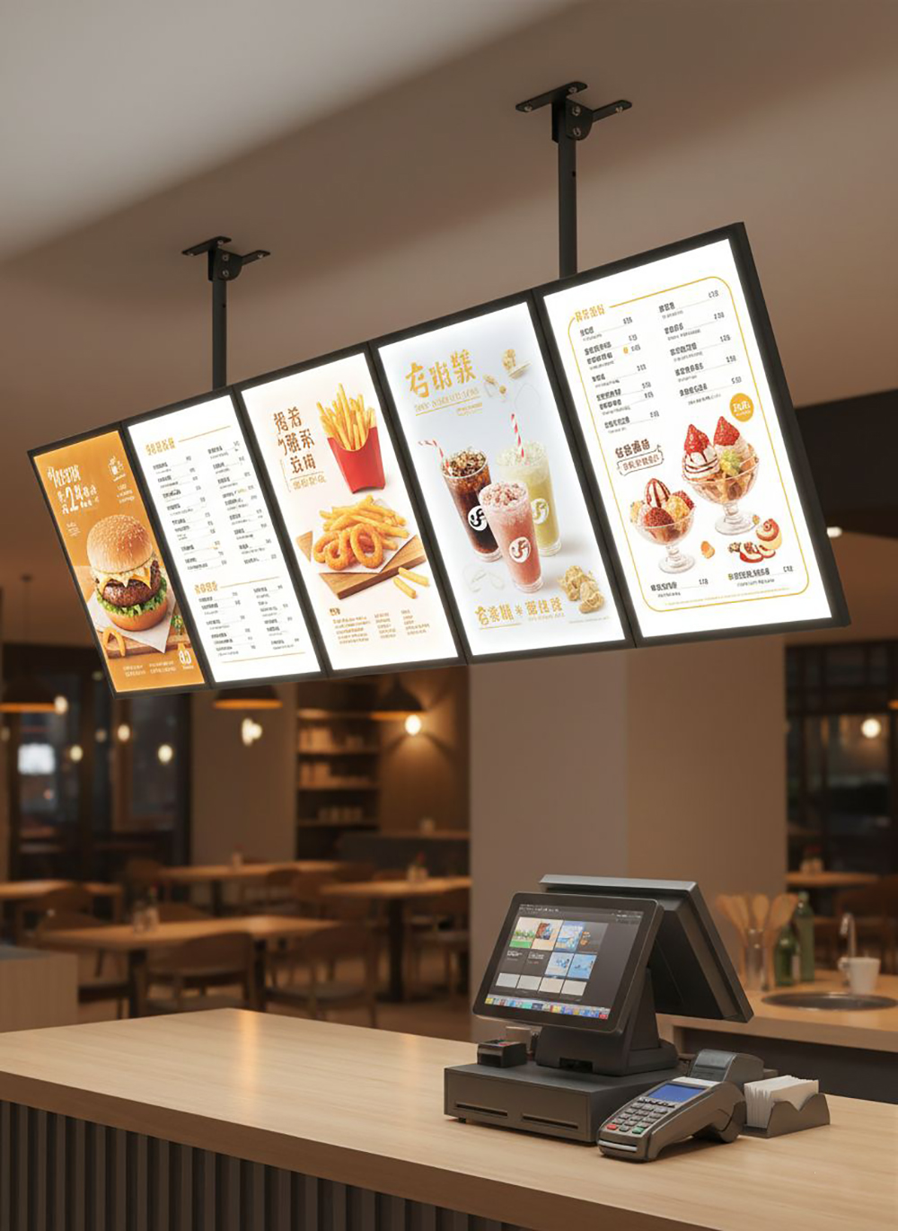
- Menu boards and digital menu displays.
- Queue-management signs.
- Order, payment, pickup, and delivery collection signs.
- Table-number signs.
- Restroom identification signs.
- Directional signs for dining areas, outdoor seating, and private rooms.
- Wall logos and feature signs for brand photography.
- Safety, capacity, and emergency signs.
- Promotional displays for seasonal offers or signature dishes.
A restaurant that uses clear directional signage can reduce staff interruptions and help first-time visitors feel more comfortable. This is especially valuable during busy service periods, when guests may be deciding whether to dine in, place an order, collect a delivery, or wait for a table.
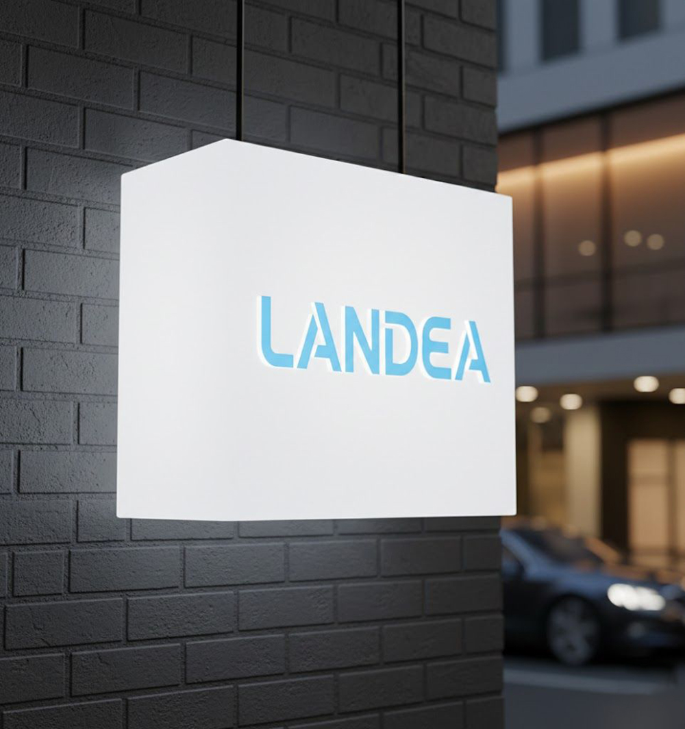
Restaurant signage must withstand real operating conditions: UV exposure, grease, humidity, rain, cleaning routines, temperature changes, and frequent use. Material selection should balance visual impact with maintenance requirements.
| Material or finish | Best use | Key advantage | Planning consideration |
|---|---|---|---|
| Acrylic | Indoor logos, illuminated letters, menu panels | Versatile, clean, available in many colors | Select appropriate thickness and finishing for scale |
| Stainless steel | Premium letters, hospitality façades | Durable, sophisticated, corrosion-resistant | Brushed, polished, painted, or plated finish changes appearance |
| Aluminum | Outdoor cabinets, channel letters, panels | Lightweight and weather-resistant | Requires proper fabrication and coating |
| PVC or foam board | Interior displays, temporary promotions | Cost-effective and easy to shape | Less suitable for high-impact exterior environments |
| LED neon flex | Feature walls, bars, cafés, events | Low-voltage, flexible, visually expressive | Use a readable layout rather than overly complex outlines |
| Vinyl graphics | Windows, walls, temporary campaigns | Fast to update and adaptable | Confirm readability and removal requirements |
For a long-term exterior project, ask the manufacturer about metal thickness, coating method, drainage, mounting structure, LED module quality, power supply access, waterproofing, and serviceability. These details are often more important than a product image alone.
A visually impressive sign that is difficult to maintain can become a costly operational problem. A well-engineered sign should allow practical inspection, cleaning, repair, and component replacement.
Illumination can transform a restaurant after sunset. It can also create glare, light spill, and approval challenges if it is not thoughtfully designed.
Different lighting styles create different brand impressions:
- Front-lit channel letters: Bright and direct; effective for high-visibility commercial locations.
- Halo-lit letters: A softer, premium glow around the back of each letter.
- Face-and-halo-lit letters: A high-impact option for brands that need stronger nighttime presence.
- External spotlights: Suitable for dimensional letters, monument signs, and architectural façades.
- LED neon: Ideal for decorative words, hashtags, illustrations, and photo backdrops.
- Backlit sign cabinets: Useful for menus, directional panels, and large graphic applications.
Avoid assuming that brighter is always better. Excessive brightness can make letters appear washed out, disturb neighboring properties, or impair visibility for drivers and pedestrians. Local lighting rules often aim to control glare and spillover while maintaining safety.
A professional lighting review should consider:
- Daytime appearance when the sign is off.
- Nighttime visibility from the main approach route.
- Brightness control and timer settings.
- Color temperature and consistency.
- Electrical access and local electrical requirements.
- Reflection on glass façades or polished surfaces.
- Neighboring residences, roads, and nearby businesses.
Accessible restaurant signs are part of good hospitality. They help more people use the space independently, while also making the environment clearer for all guests.
In the United States, certain permanent room-identification signs may require raised characters, Braille, non-glare finishes, and visual contrast. The relevant accessibility standards also define mounting-height and location requirements for tactile signs.
For restaurant projects, consider accessible signage for:
- Restrooms.
- Exits.
- Permanent room names.
- Accessible routes.
- Parking areas.
- Entrance directions.
- Pickup and service counters.
- Seating or dining-area navigation where applicable.
Tactile signs with raised characters and Braille are generally required to be mounted with the lowest tactile character baseline at least 48 inches above the finished floor or ground and the highest tactile character baseline no more than 60 inches above it.
Accessibility requirements differ by country, jurisdiction, building type, and renovation scope. Restaurant owners should confirm project-specific obligations with qualified local professionals and authorities before fabrication.
One of the most expensive restaurant signage mistakes is approving fabrication before confirming location-specific restrictions. A sign may need to comply with rules on size, height, projection, setback, placement, electrical systems, brightness, structural engineering, or historic-district appearance.
For example, the City of Nashville states that signs generally cannot be constructed, installed, or altered without required zoning, building, and other applicable permits. Its application process calls for items such as a site plan and dimensioned renderings.
Before ordering your restaurant sign, prepare the following:
1. Site photographs from key approach directions.
2. Building elevation drawings showing the proposed sign location.
3. Accurate dimensions for the façade, sign area, and mounting points.
4. Landlord or property-owner approval, where applicable.
5. Brand artwork in editable vector format.
6. Material and lighting specifications for approval submissions.
7. Structural and electrical details when required.
8. Local code review covering zoning, sign permits, and illumination.
Early review reduces the risk of redesigns, production delays, installation disputes, and unexpected costs.
Use this checklist before approving final artwork and fabrication drawings.
- Is the restaurant name readable from the main approach distance?
- Does the sign communicate the restaurant's category or personality?
- Is the logo still recognizable in daylight and at night?
- Does the message have enough contrast with the background?
- Are the most important words larger than secondary details?
- Is the sign visible around trees, awnings, parked vehicles, and neighboring signs?
- Does the illumination support visibility without excessive glare?
- Are materials suitable for the local climate and cleaning conditions?
- Can electrical components and LED modules be serviced efficiently?
- Are restroom, exit, and directional signs clear and accessible?
- Have property-owner approval and local requirements been reviewed?
- Does the entire sign system match the interior dining experience?
A restaurant sign should be designed as a business tool, a brand asset, and a physical part of the customer experience. The strongest projects bring together strategic design, engineering, fabrication quality, lighting expertise, and installation planning.
At Landea Signs Co., Ltd., we help restaurant brands turn their concepts into custom advertising signage solutions. From illuminated channel letters and stainless-steel logo signs to acrylic displays, LED neon features, cabinet signs, wayfinding systems, and custom-built exterior structures, our team can tailor materials, dimensions, finishes, lighting, and packaging to your requirements.
Share your restaurant concept, logo files, site photos, target dimensions, preferred materials, and installation location with our team. We can help you evaluate the most suitable signage solution before production begins.
The best restaurant sign depends on the location and customer journey. Front-lit or halo-lit channel letters are often effective for storefront visibility, while monument signs can suit stand-alone restaurants. Blade signs work well on pedestrian streets, and LED neon signs can create a memorable interior feature or nighttime focal point.
Letter size should be based on viewing distance, traffic speed, contrast, and typeface. A common starting guideline is about 1 inch of letter height for every 10 feet of viewing distance. A sign viewed from 30 feet away may therefore need letters around 3 inches high, subject to site testing and local requirements.
Illuminated signs can improve nighttime visibility and strengthen brand presence for restaurants open in the evening. The preferred method depends on the brand: halo lighting often feels more refined, while front lighting delivers stronger visibility. Check local brightness, electrical, and approval requirements before installation.
The exterior sign should usually prioritize the restaurant name or logo first. Add a brief cuisine cue only if the name does not make the offer clear. Avoid putting menus, multiple promotions, phone numbers, and excessive secondary details on a sign intended for distance viewing.
Requirements vary by location and project type, but permanent identification signs for spaces such as restrooms may require tactile characters and Braille under applicable accessibility standards. The U.S. Access Board provides detailed requirements for sign character, contrast, mounting, and placement.
Use suitable illumination, high-contrast colors, readable letterforms, appropriate mounting height, and a simplified message. Review the sign at night from the actual customer approach route. Avoid harsh lighting that creates glare or makes the letters difficult to read.
Provide your logo in vector format, exact sign location, site photos, building dimensions, desired sign type, target viewing distance, preferred materials, local project requirements, and any lighting preferences. This information helps the manufacturer prepare an accurate design proposal and quotation.
1. [Dave's Signs — Innovative Restaurant Sign Ideas that Captivate Customers]
2. [U.S. Access Board — Chapter 7: Signs]
3. [U.S. Access Board — ADA Accessibility Standards]
4. [GoFoodservice — Restaurant Signage Guide: How to Make Signs Work Harder]
5. [A3M — Restaurant Signage Best Practices]
6. [SF Bay Signs — The Role of Contrast in Sign Design for Better Readability]
7. [Metro Nashville Government — Sign Permit Process]
8. [City of Green, Ohio — Outdoor Lighting Regulations]
9. [Houston Sign Company — Sign Letter Visibility Distance Guide]


