From idea to market-ready product, our SIGNS solutions make every stage easier, faster. Discover How We Help

Views: 215 Author: Landea Signs Publish Time: 2026-11-01 Origin: Site


Content Menu
● 1. Start Hospital Wayfinding Signage Design With the Complete Journey
>> Map Routes Before Selecting Sign Products
>> Create One Approved Destination List
● 2. Build a Clear Hierarchy of Hospital Wayfinding Signs
● 3. Make Hospital Directional Signs Readable in Real Conditions
>> Match Lettering to Viewing Distance
>> Control Contrast, Glare, and Visual Competition
>> Use Color and Symbols as Supporting Cues
● 4. Specify Accessible Hospital Signs by Function
>> Separate Tactile Identification From Visual Directions
● 5. Choose Sign Materials Around Cleaning and Maintenance
>> Compare the Complete Sign Assembly
>> Approve a Production Sample
● 6. Combine Static and Digital Wayfinding Without Creating Dependency
>> Keep Names and Routes Synchronized
● 7. Test Wayfinding With First-Time Visitors Before Installation
>> Run a Practical Navigation Trial
>> Measure Performance Without Inventing Benchmarks
● 8. Prepare a Manufacturing-Ready Sign Schedule
● 9. Maintain the System as the Facility Changes
● Turn Your Floor Plan Into a Coordinated Signage Brief
>> What signs are essential for hospital wayfinding?
>> Does every hospital sign need braille?
>> What is the best material for hospital signs?
>> Where should hospital directional signs be installed?
>> Can digital directories replace physical hospital signs?
>> How often should hospital wayfinding signage be reviewed?
Hospital wayfinding signage design should help visitors answer three questions: Where am I? Where should I go? How will I know I have arrived? For hospitals and large facilities, effective directional signs connect entrances, parking areas, departments, elevators, and individual rooms into one understandable journey.
At Landea Signs Co., Ltd., our focus is personalized advertising signage solutions. For healthcare environments, the starting point should be the visitor's decision—not the appearance of an individual panel. Attractive signs matter, but their real value depends on whether people can use them confidently.
This guide explains how to plan a coordinated hospital wayfinding system, specify accessible signs, select practical materials, and test routes before full installation.

A visitor's journey begins before the reception desk. It may start with an appointment message, a parking entrance, or a pedestrian route from public transport.
If those touchpoints use different building names, even well-designed interior signs can create confusion.
Walk priority routes from the perspective of someone unfamiliar with the site. Include:
- Parking areas and passenger drop-off points.
- Main, emergency, and accessible entrances.
- Registration and reception.
- Elevators, stairs, and connecting corridors.
- Treatment departments, toilets, and exits.
Record each location where visitors must choose a direction. Then check whether they can see the relevant information before making that choice.
Do not forget return journeys. Finding a clinic does not automatically mean someone can find the correct parking area afterward.
Use consistent names across appointment letters, websites, directories, and physical signs.
If a department has a technical name, consider whether a plain-language explanation would help. However, do not replace clinical terminology without approval from the hospital team.
Assign every destination a preferred name, abbreviation policy, building reference, and floor designation. This becomes the foundation for sign content and future updates.
Different signs answer different questions. Trying to place every destination on every panel produces clutter rather than clarity.
Use progressive disclosure: provide the information needed for the next decision, then reveal more detail as visitors approach their destination.
| Sign Type | Primary Purpose | Typical Location |
|---|---|---|
| Site identification | Confirm the correct campus or building | Site entrances and approach roads |
| Orientation directory | Explain the overall layout | Main entrances and major lobbies |
| Directional sign | Guide the next movement | Junctions and elevator approaches |
| Confirmation sign | Reassure visitors after a turn | Long corridors and connecting routes |
| Room identification | Confirm arrival | Beside relevant doors |
| Regulatory or safety sign | Communicate required instructions | Locations determined by applicable requirements |
Keep emergency and life-safety information distinct from promotional messages. A hospital advertisement should never compete with a critical directional instruction.
A design can look clear on a computer screen and fail in a busy corridor. Evaluate signs at their intended size, location, and viewing distance.
There is no single letter size suitable for every hospital sign. Character height depends on viewing distance, mounting height, obstructions, and applicable accessibility requirements.
Use straightforward typefaces with distinguishable characters. Avoid decorative lettering for essential directions.
Keep messages concise. A corridor sign should support a quick decision, not explain the hospital's organizational structure.
Use clear light-on-dark or dark-on-light contrast. Assess the finished surface under actual lighting because reflections can obscure otherwise readable text.
Check visibility from standing and seated positions. Look for interference from open doors, ceiling equipment, temporary notices, and crowded waiting areas.
Color-coded zones can support orientation, but color should not carry the entire message.
Pair each zone with a name, letter, number, or recognizable landmark. For example, "East Building — Zone B" provides more information than a blue stripe alone.
Use familiar symbols alongside text where useful. Test unfamiliar pictograms with intended users rather than assuming their meaning is universal.
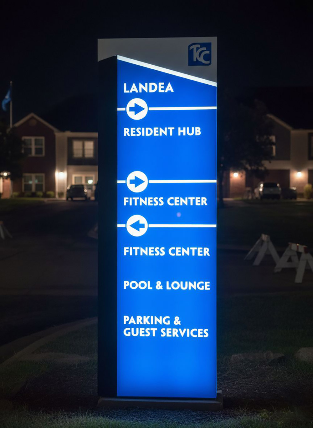
Accessibility is not achieved simply by adding braille to every panel.
For projects in the United States, the applicable ADA provisions distinguish between permanent room identification signs and directional or informational signs. Other countries have different requirements, so establish the project jurisdiction before approving specifications.
Permanent room and space identification signs generally require raised characters and braille, subject to the applicable scoping provisions.
Directional and informational signs generally need to meet visual requirements but are not automatically required to be tactile.
This distinction affects panel design, installation locations, and procurement quantities.
For applicable U.S. tactile signs, requirements address character baselines, clear floor space, and positioning near doors. The commonly cited 48–60-inch mounting range concerns tactile character baselines, not the overall panel height.
Avoid issuing a generic instruction such as "install all signs at 60 inches."
Have the project's accessibility specialist verify the sign schedule, drawings, and installation details. A manufacturer's product specification does not, by itself, establish whole-project compliance.
Accessible routes also need continuous guidance. Directing visitors to an elevator is insufficient if the route beyond it becomes unclear.
Material selection should consider more than appearance. Hospital signs must fit the facility's cleaning procedures, maintenance resources, and replacement strategy.
| Material or System | Potential Application | Main Verification Point |
|---|---|---|
| Coated aluminum | Directional panels and modular systems | Coating durability and cleaner compatibility |
| Acrylic | Interior identification and decorative panels | Scratching, chemical compatibility, and mounting |
| Stainless steel | Selected identification and high-contact locations | Glare, finish, weight, and cleaning response |
| Replaceable inserts | Frequently changing room or department information | Legibility, secure retention, and update method |
| Printed graphics with protective finishes | Maps, directories, and wall graphics | Adhesion, abrasion, and approved cleaning methods |
These are starting points, not universal material approvals.
Evaluate the substrate, printed graphics, coating, adhesive, edges, and fixings together. A durable metal panel can still fail if its graphic layer reacts poorly to the cleaning product.
Before full manufacturing, review a sample using the proposed cleaning agent, dilution, contact time, and wiping method.
Check for fading, surface damage, edge lifting, and reduced readability.
Describe materials as compatible with specified procedures only when supported by suitable documentation or testing. Avoid unsupported claims that a sign is "infection-proof" or universally resistant to disinfectants.
Digital directories can help communicate changing department information. However, visitors should still be able to navigate essential routes when a screen is unavailable.
Use permanent signs for stable information and digital displays where frequent updates provide genuine value.
A digital directory and a wall sign should use the same destination names, floor references, and zone identifiers.
Assign responsibility for updating both. Otherwise, a department relocation may appear on the screen while old directional panels remain in place.
QR codes can provide optional maps or additional language support, but they should not be the only route to essential directions.
Visitors may have limited connectivity, low battery power, impaired vision, or no suitable device. Retain a readable physical alternative.
One of the most useful project improvements is a route test using temporary, full-size sign mockups.
Do not rely exclusively on staff feedback. Employees already know the building and may unconsciously fill gaps that confuse newcomers.
1. Select representative journeys, including an accessible route.
2. Install temporary signs in realistic positions.
3. Recruit participants unfamiliar with the layout.
4. Ask them to find destinations without coaching.
5. Record hesitation, missed turns, backtracking, and requests for help.
6. Revise the information or placement and repeat the test.
Where appropriate, include older adults, wheelchair users, and people with different language or visual needs. Obtain consent and follow facility rules.
Track route completion, wrong turns, assistance requests, and travel time. Compare results before and after revisions under similar conditions.
Treat these measurements as project evidence, not guaranteed outcomes. There is no universal percentage improvement that every new hospital signage system will achieve.
If several participants make the same mistake, investigate the decision point before simply adding another sign.
A clear sign schedule connects planning with production. Without one, approved layouts can become inconsistent panels, incorrect quantities, or installation delays.
For each sign, record:
- Unique sign ID and installation location.
- Sign type, dimensions, and viewing direction.
- Approved wording, arrows, symbols, and languages.
- Material, finish, and mounting method.
- Applicable tactile or braille requirements.
- Artwork revision and approval status.
- Installation notes and maintenance ownership.
Request full-size artwork for critical signs. Small presentation layouts can hide spacing problems and unreadable secondary text.
For modular systems, confirm how replacement inserts will be ordered and whether future changes require replacing the entire assembly.
Hospital wayfinding is an operational system, not a one-time decoration project.
Review affected routes whenever departments move, entrances close, construction begins, or accessible paths change. A fixed replacement cycle alone cannot address these events.
Keep an asset register linking sign IDs to approved artwork and locations. Assign a named role or team to authorize changes.
Temporary signs should follow the same naming and arrow conventions as permanent signs. Remove obsolete information promptly so visitors do not have to choose between conflicting instructions.
Effective hospital wayfinding connects understandable language, accessible information, readable design, practical fabrication, and ongoing maintenance.
For a tailored signage discussion with Landea Signs Co., Ltd., prepare your floor plans, destination list, installation locations, project jurisdiction, and cleaning requirements. Include photographs of difficult junctions and any existing design standards.
Share these materials with Landea Signs Co., Ltd. to discuss a personalized signage solution, sample requirements, and a coordinated production brief. Resolve critical route decisions before manufacturing begins.
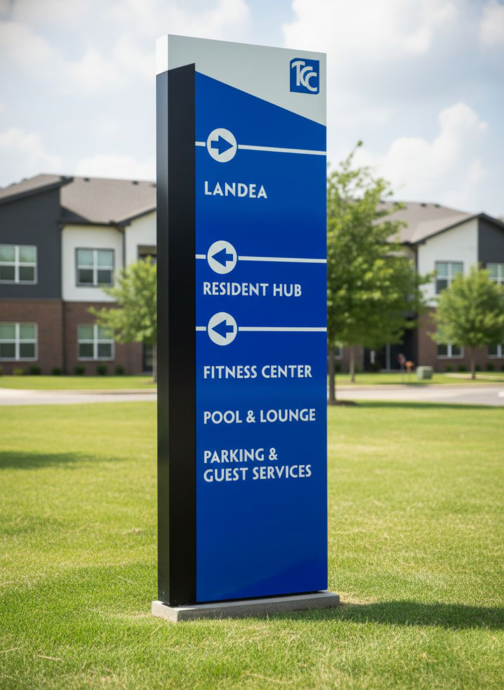
Most projects need building identification, orientation directories, directional signs, destination identification, and applicable safety signs. The exact mix depends on site size, route complexity, visitor needs, and local requirements—not a standard product bundle.
No. Under applicable U.S. ADA provisions, permanent room identification signs generally require tactile information, while directional and informational signs generally follow visual requirements. Confirm the requirements for each sign type and project jurisdiction.
There is no universally best material. Compare readability, cleaning compatibility, durability, mounting conditions, and replacement needs. Approve the complete sign assembly rather than selecting solely by substrate.
Place them where visitors need to make decisions, with enough advance visibility to act. Check approaches to entrances, corridor junctions, elevators, and transitions between buildings. Add confirmation where visitors might reasonably doubt their route.
Not entirely. Digital directories can support changing information, but essential navigation should remain usable during outages or device limitations. Coordinate digital content with permanent signs and provide accessible alternatives.
Review affected signs whenever routes or destinations change. Supplement change-triggered reviews with routine inspections for damage, obstruction, outdated wording, and inconsistent temporary notices. Set inspection frequency according to facility conditions and operational risk.
1. Cosun Sign. "Wayfinding Signage Design Tips for Hospitals and Large Facilities." Original article reviewed for its planning, readability, branding, accessibility, and digital-integration coverage. The rewrite does not adopt its company-specific claims or imply affiliation with Landea Signs Co., Ltd. [en.cosunsign]
2. NHS England. "Wayfinding: Effective Wayfinding and Signing Systems—Guidance for Healthcare Facilities." Publication page dated May 21, 2021; provides healthcare wayfinding assessment and improvement guidance. [england.nhs]
3. U.S. Access Board. "Guide to the ADA Accessibility Standards, Chapter 7: Signs." Explains differences between tactile identification and visual directional signs, together with installation and legibility requirements. [access-board]
4. U.S. Access Board. "ADA Accessibility Standards," Sections 216 and 703. Primary provisions for sign scoping, raised characters, braille, mounting, finish, contrast, and visual characters. [access-board]
5. NHS England. "Health Building Note 00-01: General Design Guidance for Healthcare Buildings." Supports integrated external and internal wayfinding, landmarks, clear parking connections, and consideration of sign visibility. [england.nhs]
6. U.S. Access Board. "Guide to the ADA Accessibility Standards, Chapter 4: Accessible Means of Egress." Clarifies distinctions between tactile exit identification and visual directional information. [access-board]


