From idea to market-ready product, our SIGNS solutions make every stage easier, faster. Discover How We Help

Views: 222 Author: Landea Signs Publish Time: 2026-07-14 Origin: Site


Content Menu
● Core Definitions And Use Cases
>> What Are Fire-Rated Braille Signs?
>> What Are Standard Plastic Signs?
● Safety And Compliance: Not All Signs Are Equal
>> Fire Performance And Life Safety
>> Accessibility And Tactile Readability
● Material And Construction Differences
>> Tactile And Braille Production Techniques
● Cost, Lifecycle, And Total Value
>> Upfront Pricing vs. Long-Term Cost
>> How Users Actually Find Their Way
>> Perception Of Quality And Trust
● Can Fire-Rated And Plastic Signs Look Consistent?
>> Aligning Fire-Rated Signs With Visual Branding
>> Using Standard Plastic Signs For Secondary Layers
● Choosing Between Fire-Rated Braille And Standard Plastic
>> Step-by-Step Decision Guide
● Why Manufacturers Are Pushing Beyond "Basic Plastic"
>> Trends Driving Higher Standards
>> The Manufacturer's Perspective
● Comparing Fire-Rated Braille Signs And Standard Plastic Signs
● FAQs
Fire-rated Braille signs and standard plastic signs serve very different roles in modern buildings, especially when safety, accessibility, and long-term performance are on the line. Understanding these differences helps facility managers, architects, and brand owners make confident, code-aligned decisions instead of treating signage as a last-minute purchase. [landeasigns]
In day-to-day projects, it is tempting to treat all room signs as interchangeable plaques that simply carry text and maybe a pictogram. Yet when you walk a real building during an inspection, you quickly see that life safety signage and accessibility signage have to meet far stricter expectations than generic plastic door signs. [linkedin]
Fire-rated Braille signs combine three critical functions in one product: fire performance, tactile readability, and compliant Braille for people with visual impairments. In contrast, standard plastic signs are primarily visual identifiers; they may look similar at a glance, but they rarely carry the engineering, testing, and tactile detail needed for high-risk zones or regulatory inspections. [landeasigns]
Fire-rated Braille signs are engineered identification or wayfinding plaques manufactured from fire-resistant substrates that maintain structural integrity and legibility under elevated temperatures for a defined period. They integrate raised characters and Grade 2 Braille so that users with low vision or total blindness can read critical information by touch even in low-visibility or emergency scenarios. [linkedin]
These signs typically appear in:
- Stairwells and fire exits where evacuation routes must remain readable and intact. [landeasigns]
- Areas of refuge and safe egress points where tactile clarity can literally guide users to safety. [landeasigns]
- Mechanical and electrical rooms with fire-rated doors or walls that fall under stricter building codes. [landeasigns]
Standard plastic signs are everyday identification plaques produced from materials such as acrylic, PVC, ABS, or other polymers, often used for offices, meeting rooms, washrooms, and back-of-house spaces. They may be visually attractive and budget-friendly, but most are not tested for fire performance beyond basic building material requirements. [linkedin]
Common use cases include:
- Office doors and departmental markers where risk levels are lower. [linkedin]
- Temporary or semi-permanent informational signs like "Meeting in progress" or "Staff only." [linkedin]
- Branding panels and decorative feature signs where aesthetics matter more than fire engineering. [linkedin]
From an engineering perspective, fire-rated signage is designed to resist ignition, limit flame spread, and stay legible in elevated temperatures for a defined period based on relevant standards and test protocols. In critical locations—stair cores, exit routes, fire doors—signs must not warp, melt, or release excessive smoke that could confuse or endanger occupants. [landeasigns]
Standard plastic signs, by contrast, often soften or deform much earlier in a fire, and their pigments or adhesives may degrade to the point where text becomes unreadable just when occupants most need clarity. For building owners, the distinction is more than theoretical: insurance requirements, inspection reports, and post-incident analyses increasingly focus on whether signage in escape routes is both accessible and fire-resilient. [landeasigns]

Fire-rated Braille signs are designed around tactile usability: raised characters within defined height and stroke ranges, precise cell spacing for Grade 2 Braille, and non-glare finishes that support both touch and low-vision reading. This multi-sensory design makes doors, stairwells, and key rooms usable for occupants who cannot rely on print alone. [linkedin]
Standard plastic signs may include raised text or pictograms, but many "decorative" products use flat printing, glossy coatings, or non-standard fonts that visually impress but tactically fail. When you run your fingers across these surfaces, you often feel sharp edges, inconsistent dot heights, or no tactile features at all, which can be confusing or painful for regular Braille users. [linkedin]
Well-designed fire-rated Braille signs typically use fire-resistant cores such as treated metals, mineral-filled composites, or engineered laminates paired with durable surface films. These substrates allow manufacturers to deliver consistent tactile depth and Braille quality while meeting building code expectations for flame spread and smoke development. [landeasigns]
Standard plastic signs usually rely on common acrylics, PVC, or other thermoplastics that perform well under normal conditions but may soften, burn, or emit smoke more readily in a fire. While these materials are ideal for many low-risk interior applications, they are not intended as a primary life safety component in evacuation pathways. [landeasigns]
Manufacturers of high-quality fire-rated Braille signs invest heavily in production methods that deliver consistent, comfortable tactile surfaces: routed or laser-cut appliqué for raised letters, embedded domed spheres for Braille dots, and carefully controlled coatings. The goal is to offer smooth, finger-friendly contours that can be read quickly without fatigue. [linkedin]
By contrast, some low-cost plastic signs use UV-printed tactile layers or improvised dot patterns that feel scratchy or brittle and may chip over time. While these products can meet basic visual needs, they often fail under detailed inspection of Braille quality and long-term durability in high-traffic environments. [linkedin]
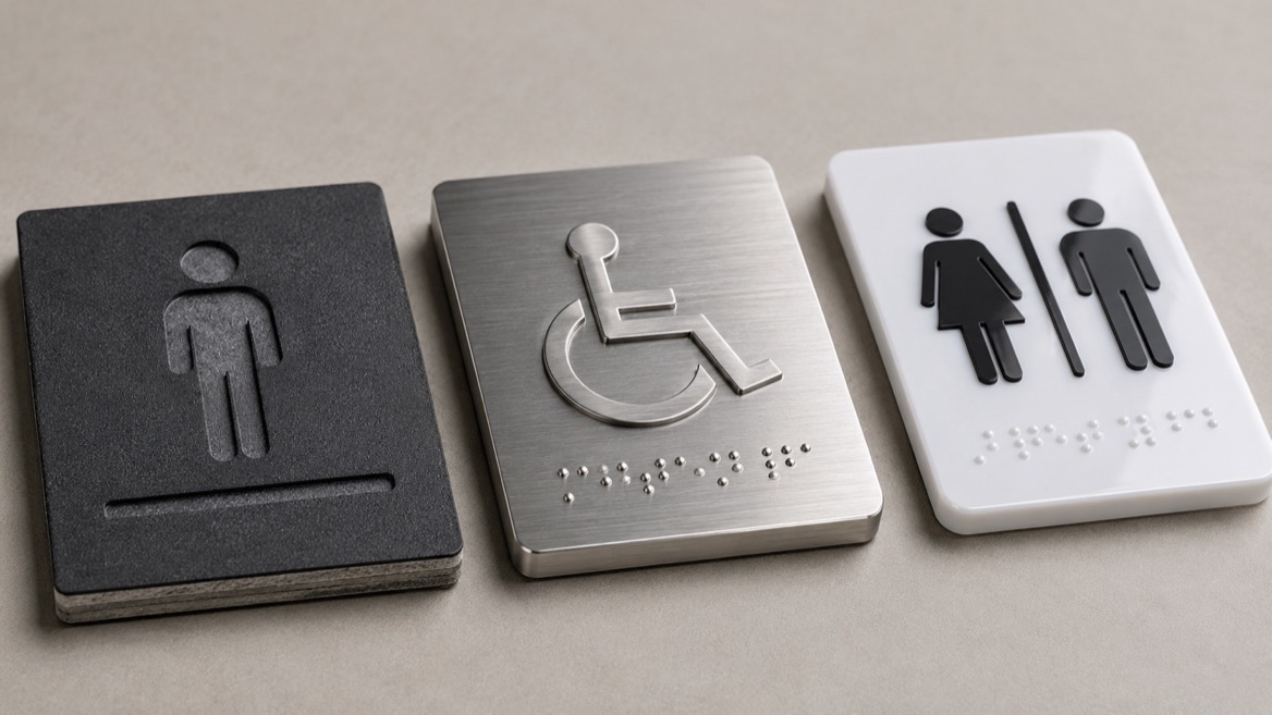
On a pure unit price basis, fire-rated Braille signs typically cost more than basic plastic plaques because they combine specialized materials, tactile machining, and compliance-grade Braille. However, when you consider replacement cycles, inspection failures, and potential legal exposure, the cost equation changes significantly. [landeasigns]
Standard plastic signs can be attractive for low-risk, non-critical zones, but they are more likely to require replacement after renovations, regulatory updates, or minor damage, especially when designs are not standardized. In critical locations, under-specifying signage can lead to failed inspections and emergency retrofits that erase any initial savings. [landeasigns]
Fire-rated Braille signs tend to use robust, non-glare finishes and stable substrates that resist warping, UV fading, and abrasion, even under frequent cleaning. Their tactile elements are designed to maintain height and clarity in high-traffic environments such as hospitals, transit hubs, or multi-storey workplaces. [linkedin]
Standard plastic signs can be perfectly adequate where traffic is moderate and surfaces are protected, but their raised details—if present—are often more vulnerable to impact, cleaning chemicals, and long-term wear. In practice, facility teams often find themselves replacing popular "decorative" plastic signs earlier than expected because the printed detail cannot withstand daily use. [linkedin]
When you observe occupants navigating a building during a drill or real incident, you see two patterns: people rely on habit in familiar spaces but depend on signs when stressed or disoriented. In these moments, exit markers, stair identifiers, and refuge areas must be readable to users of different ages, languages, and abilities. [landeasigns]
Fire-rated Braille signs contribute to a smoother experience by combining legible visual contrast, clear pictograms, and tactile information that remains usable even when smoke, low lighting, or crowding reduce visibility. Standard plastic signs may still help, but only if they have appropriate contrast, mounting height, and clear wording—and they may fail precisely when conditions worsen. [landeasigns]
Everyday visitors rarely notice highly compliant signage; they simply experience a space that "just works"—rooms are easy to find, exits feel obvious, and symbols are familiar. Conversely, mismatched plastic plaques, inconsistent fonts, and confusing labels signal a lack of care that can undermine trust in the overall facility. [landeasigns]
From a brand standpoint, investing in coordinated sign families—where fire-rated Braille signs and standard plastic signs share a coherent design language—communicates competence and responsibility. It shows that the organization considers both aesthetics and user safety rather than treating signs as a miscellaneous hardware purchase. [landeasigns]
A common concern among architects and brand teams is that technical requirements will ruin the design. Yet modern fire-rated Braille signs can be produced with custom faceplates, brand-aligned color palettes, and carefully integrated logos or icons, so long as tactile areas, Braille cells, and contrast rules remain protected. [linkedin]
Manufacturers experienced in architectural signage help clients define a design system:
- Approved colors that balance brand identity with strong contrast. [landeasigns]
- Font choices that respect brand typography while staying readable and compliant. [linkedin]
- Standardized layouts so room IDs, exits, and refuge signs feel like part of one family.
Standard plastic signs still have a valuable role in a well-designed building when they complement, rather than replace, specialized fire-rated Braille signage. They can deliver cost-effective coverage for secondary information such as departmental names, temporary instructions, or decorative branding elements. [linkedin]
By placing fire-rated Braille signs on doors and critical pathways and using plastic signs for supporting information away from the main circulation routes, facility teams strike a balance between performance and budget while keeping visual coherence. [linkedin]
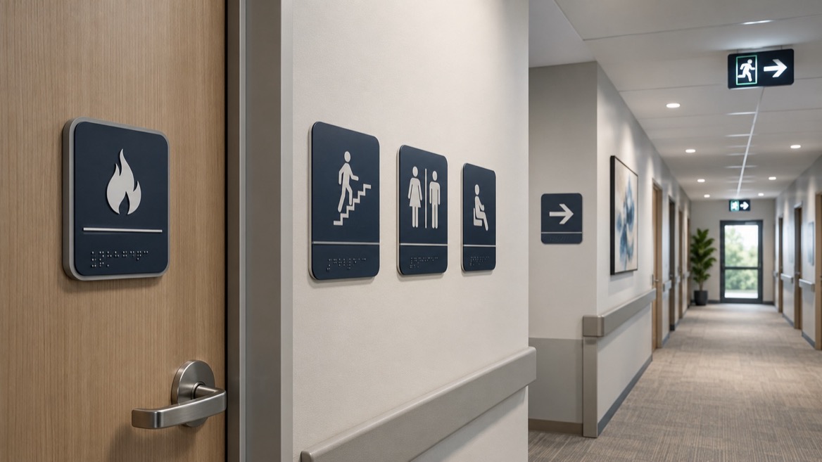
When advising clients, a simple decision checklist helps clarify which sign type fits each location:
1. Identify risk level for each door or space.
- Stairwells, exits, refuge areas, mechanical rooms: higher risk.
- Offices, meeting rooms, staff areas: moderate to low risk. [landeasigns]
2. Confirm accessibility expectations.
- If the door identifies a permanent room or critical route, prioritize raised characters and Grade 2 Braille. [linkedin]
- If the sign is temporary or overhead, tactile features may be less critical. [linkedin]
3. Map code and inspection requirements.
- Check local building codes and fire regulations to determine where fire-rated products are expected or required. [landeasigns]
- Verify mounting heights, contrast, and tactile standards before specifying materials. [landeasigns]
4. Define your visual hierarchy.
- Decide which information must be instantly readable and tactile, and which can remain secondary or decorative.
- Maintain consistent typography, iconography, and color usage across both sign families. [landeasigns]
5. Plan lifecycle and budget.
- Consider how often spaces change functions, how frequently signs are touched, and how cleaning practices might affect materials. [landeasigns]
- Allocate higher investment to safety-critical and accessibility-critical signage, using simpler plastic signs where risk and exposure are lower. [linkedin]
In recent years, manufacturers and specifiers have seen greater emphasis on contrast, tactile quality, and robustness in life-safety signage as both regulators and building owners understand the real-world impact of accessible wayfinding. Large projects increasingly demand fully integrated packages that cover fire doors, escape routes, elevators, and accessible facilities with coherent tactile and Braille strategies. [linkedin]
At the same time, global brands exporting signage solutions are learning that one neutral plastic plaque rarely satisfies different jurisdictions. Fire performance expectations, tactile rules, and accessibility norms vary, so versatile sign families must be engineered to travel across markets without losing their safety credentials. [linkedin]
From a manufacturing standpoint, upgrading from basic plastic to fire-rated Braille solutions is not only about compliance; it is about reducing risk for clients and ensuring repeatable quality at scale. When a project spec calls for 500 stair and exit signs for a hospital or corporate campus, each plaque must deliver consistent tactile depth, reliable Braille translation, and predictable behavior under stress. [landeasigns]
Manufacturers with dedicated tactile and Braille production capabilities invest in process control, material testing, and template standardization so facility teams can order replacement signs years later and still receive products that match both visually and technically. [linkedin]
| Feature / Aspect | Fire-Rated Braille Signs | Standard Plastic Signs |
|---|---|---|
| Core function | Combined fire performance and tactile accessibility for critical locations. (landeasigns) | Visual identification for general rooms and information. (linkedin) |
| Materials | Fire-resistant metals or engineered composites with durable non-glare finishes. (landeasigns) | Common plastics like acrylic or PVC, optimized for cost and visual effect. (linkedin) |
| Tactile and Braille | Raised characters plus Grade 2 Braille produced with precise, finger-friendly methods. (landeasigns) | May be flat-printed, partially tactile, or non-compliant Braille, depending on supplier. (linkedin) |
| Fire behavior | Designed to resist ignition, limit flame spread, and maintain legibility under heat. (landeasigns) | Likely to soften, deform, or burn earlier, reducing readability under fire conditions. (landeasigns) |
| Typical locations | Stairwells, exits, areas of refuge, mechanical rooms, high-risk zones. (landeasigns) | Offices, meeting rooms, staff areas, decorative signage, temporary information. (linkedin) |
| Inspection focus | Subject to closer scrutiny for both accessibility and fire safety performance. (landeasigns) | Generally assessed for basic readability and placement, less tied to life safety. (landeasigns) |
| Lifecycle value | Higher upfront cost but stronger long-term safety, durability, and compliance. (landeasigns) | Lower upfront cost but higher risk of early replacement or retrofit in sensitive areas. (landeasigns) |
Q1: Do all signs in a building need to be fire-rated and tactile?
No. Only signs in specific high-risk or safety-critical locations typically require both fire performance and tactile/Braille details; many interior identification signs can remain standard plastic if they are readable and appropriately placed. [landeasigns]
Q2: Where are fire-rated Braille signs most important?
They are most critical at stairwells, exits, areas of refuge, and doors leading to mechanical or electrical rooms that form part of the formal fire egress strategy. [landeasigns]
Q3: Can standard plastic signs ever be suitable for accessible wayfinding?
Yes, provided they use high contrast, non-glare finishes, appropriate fonts, and—where required—proper tactile characters and Grade 2 Braille; however, they may still fall short on fire performance in high-risk zones. [linkedin]
Q4: How can I keep designs consistent across both sign types?
Define a common set of fonts, icons, and color rules, then work with a manufacturer who can translate that design language into both fire-rated Braille and standard plastic products without compromising technical requirements. [landeasigns]
Q5: What is the biggest mistake in specifying signs for critical areas?
The most costly mistake is treating exit and stair signs as simple decorative plastic plaques, without considering fire behavior and tactile accessibility, which can lead to inspection issues and higher retrofit costs. [linkedin]
1. Landea Signs Co., Ltd – "Braille Signs vs. Tactile Signs: What's the Real Difference?" (architectural signage, tactile vs. Braille, global standards). [https://www.landeasigns.com/braille-signs-vs-tactile-signs-what-s-the-real-difference.html] [linkedin]
2. Landea Signs Co., Ltd – "ADA Signage In 2026: A Practical, Expert Guide For Safer, More Inclusive Spaces" (ADA requirements, sign types, mounting rules, emerging trends). [https://www.landeasigns.com/ada-signage-in-2026-a-practical-expert-guide-for-safer-more-inclusive-spaces.html] [landeasigns]
3. Landea Signs Co., Ltd – Corporate site and product overview (custom advertising and architectural signage manufacturing capabilities). [https://www.landeasigns.com/custom-advertising-signage-for-global-brands-oem-quality-signage-from-china.html] [landeasigns]
4. Landea Signs Co., Ltd – Company background and global offices (manufacturing base, export markets, project experience). [https://www.landeasigns.com/aboutus.html] [landeasigns]
5. SEGD – Wayfinding and Accessibility guidance (industry context on tactile and Braille signage in experiential environments). [https://segd.org] [landeasigns]


